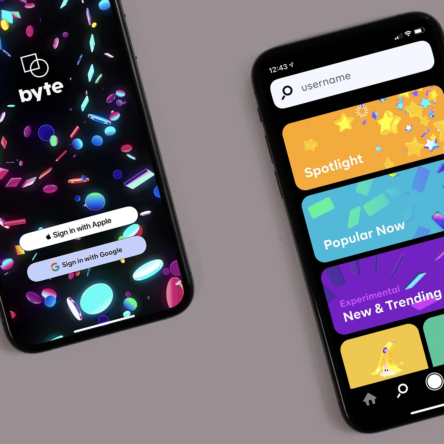
Users faced inconsistent sign-in experiences across our applications—each product had evolved its own authentication patterns, creating confusion and friction. I led efforts to consolidate these into a standardized sign-in flow, then designed consistent multifactor authentication patterns in phase two.
This phased approach is part of a multi-year initiative to deliver a seamless, universal authentication experience across our entire product ecosystem.

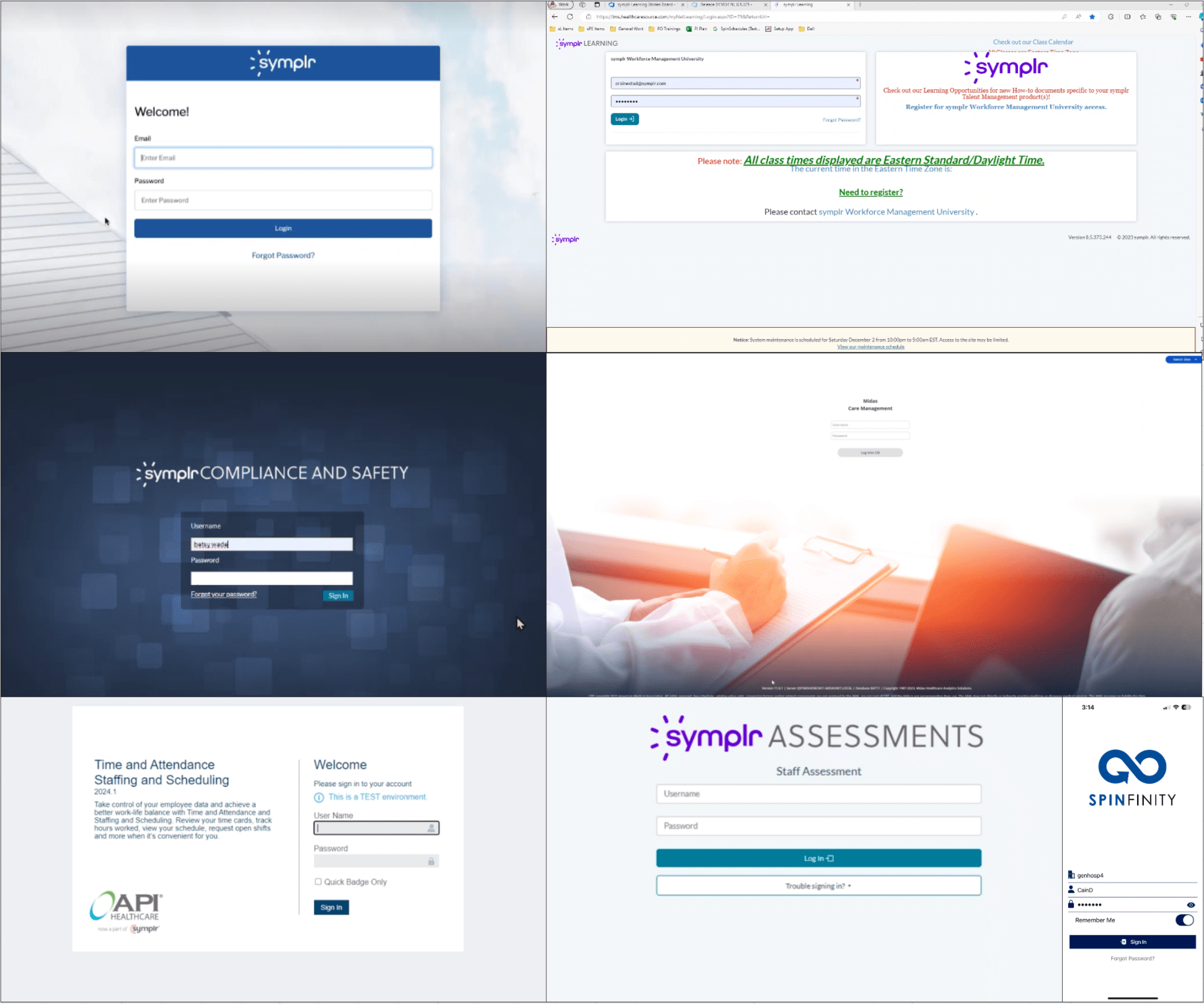
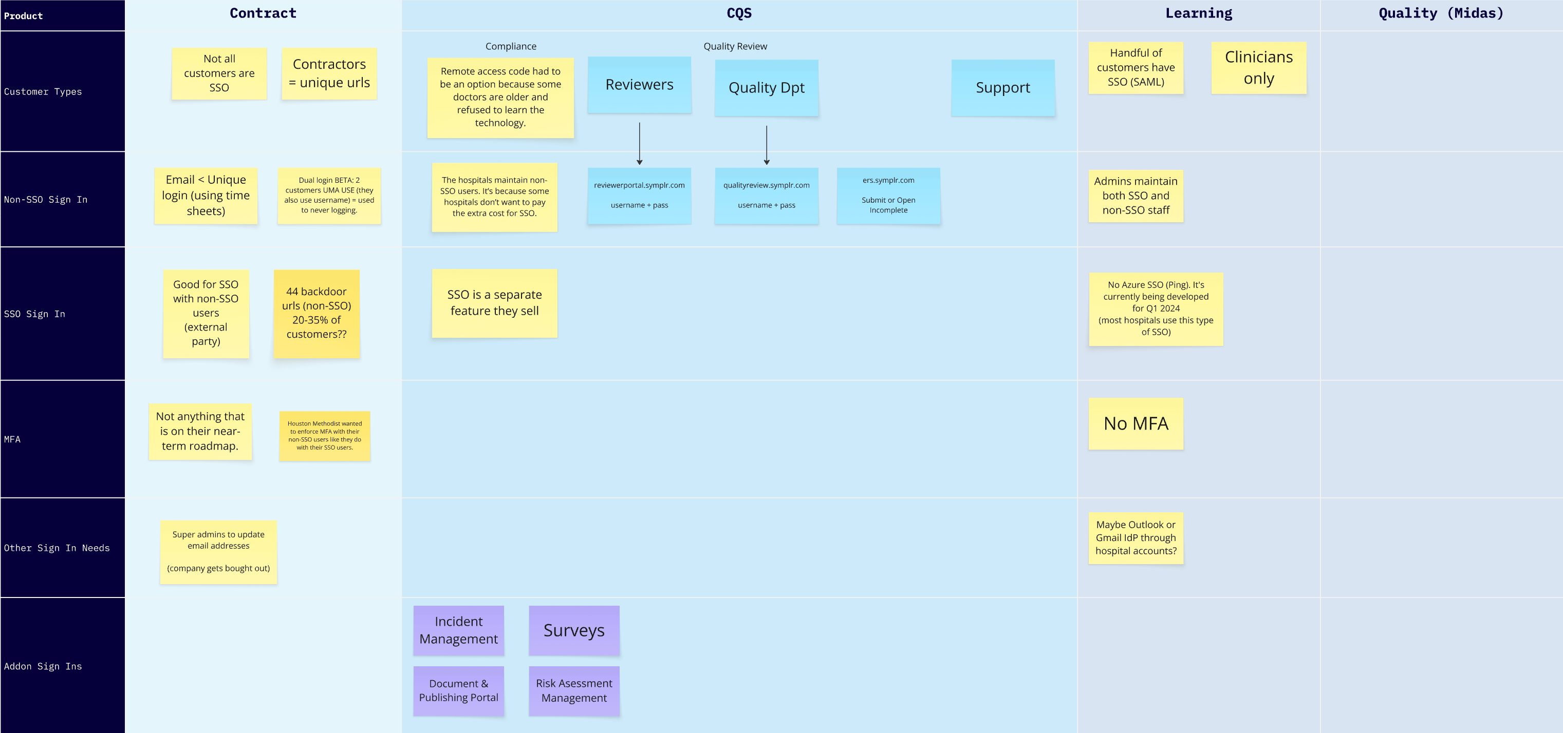
Audited sign-in requirements across all products to ensure the new design supported each product's specifications.
The tight timeline required fast iteration—I quickly explored several design approaches to find the optimal solution.
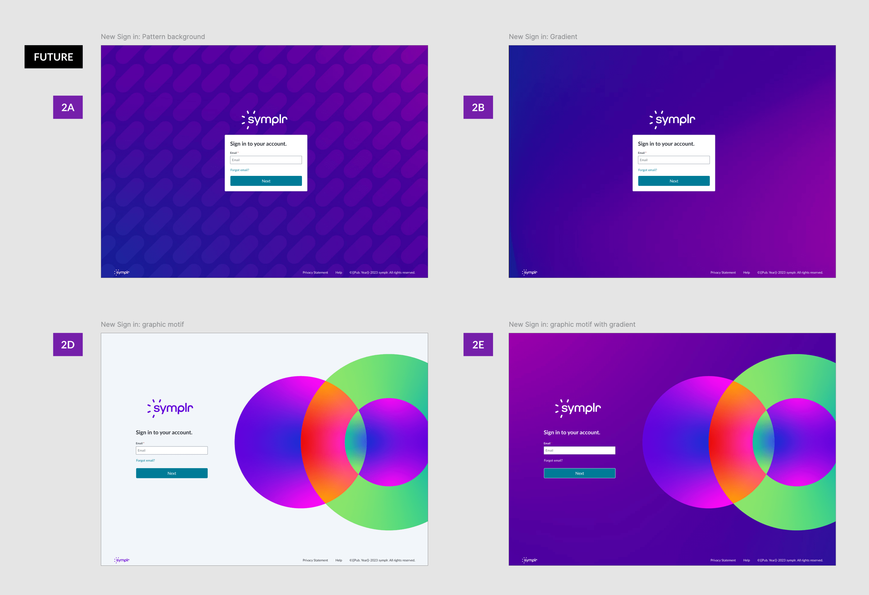
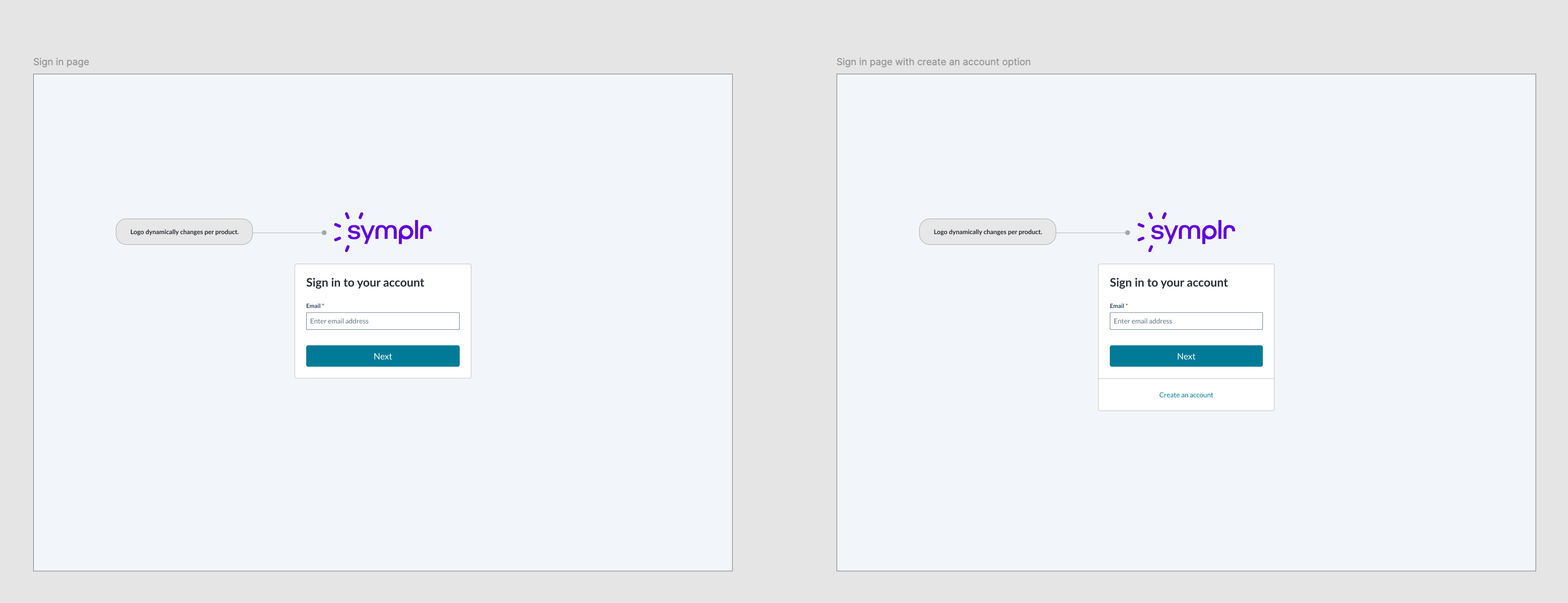
Future-ready variations of the universal sign-in pattern.
With the universal sign-in pattern established in phase 1, phase 2 focused on creating a consistent multifactor authentication experience.
Collaborated with product teams to map the multifactor authentication flow and requirements.
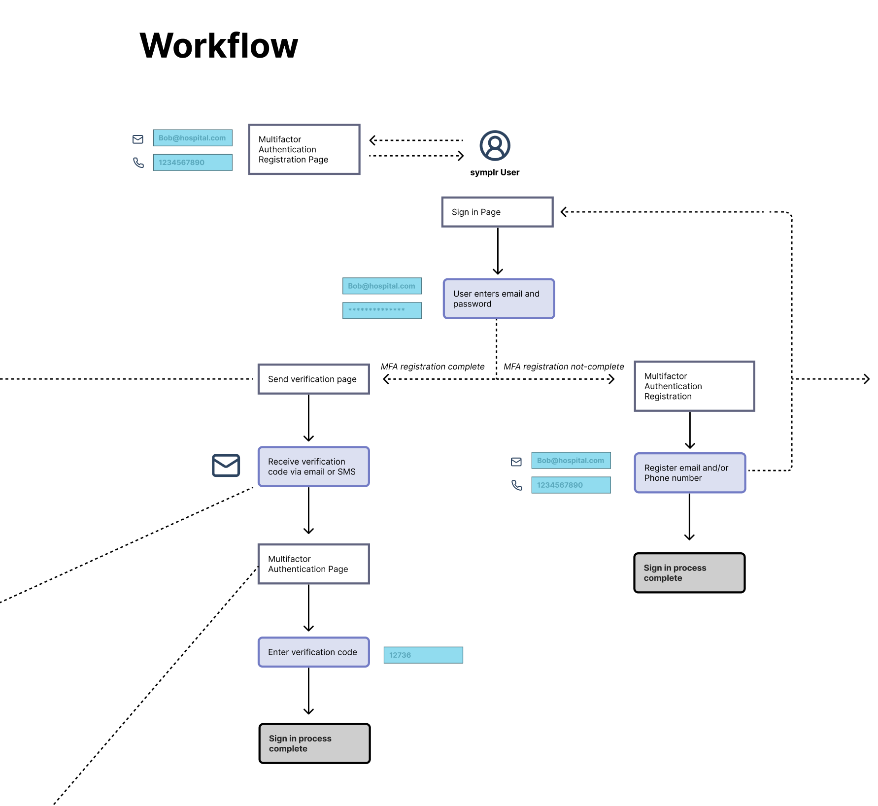
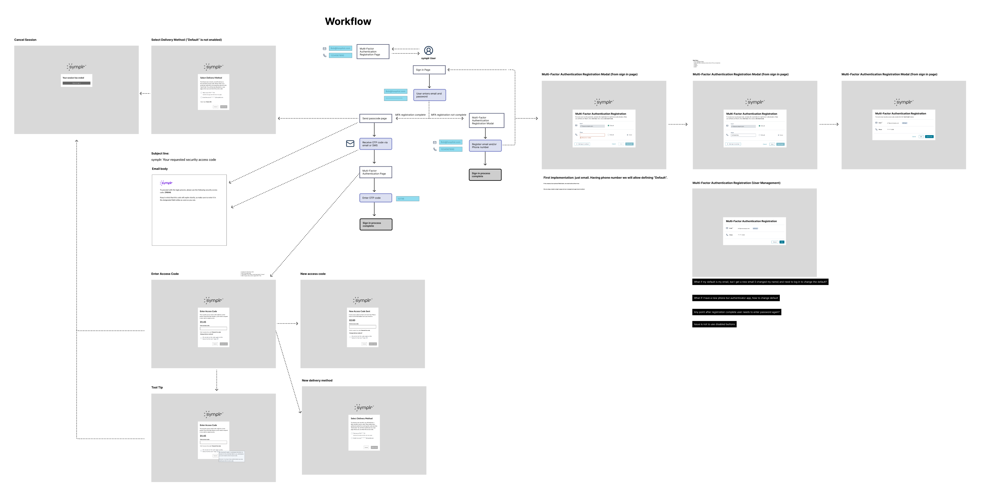
Explored multiple design options for the multifactor authentication flow.
Key screens from the final authentication flow.
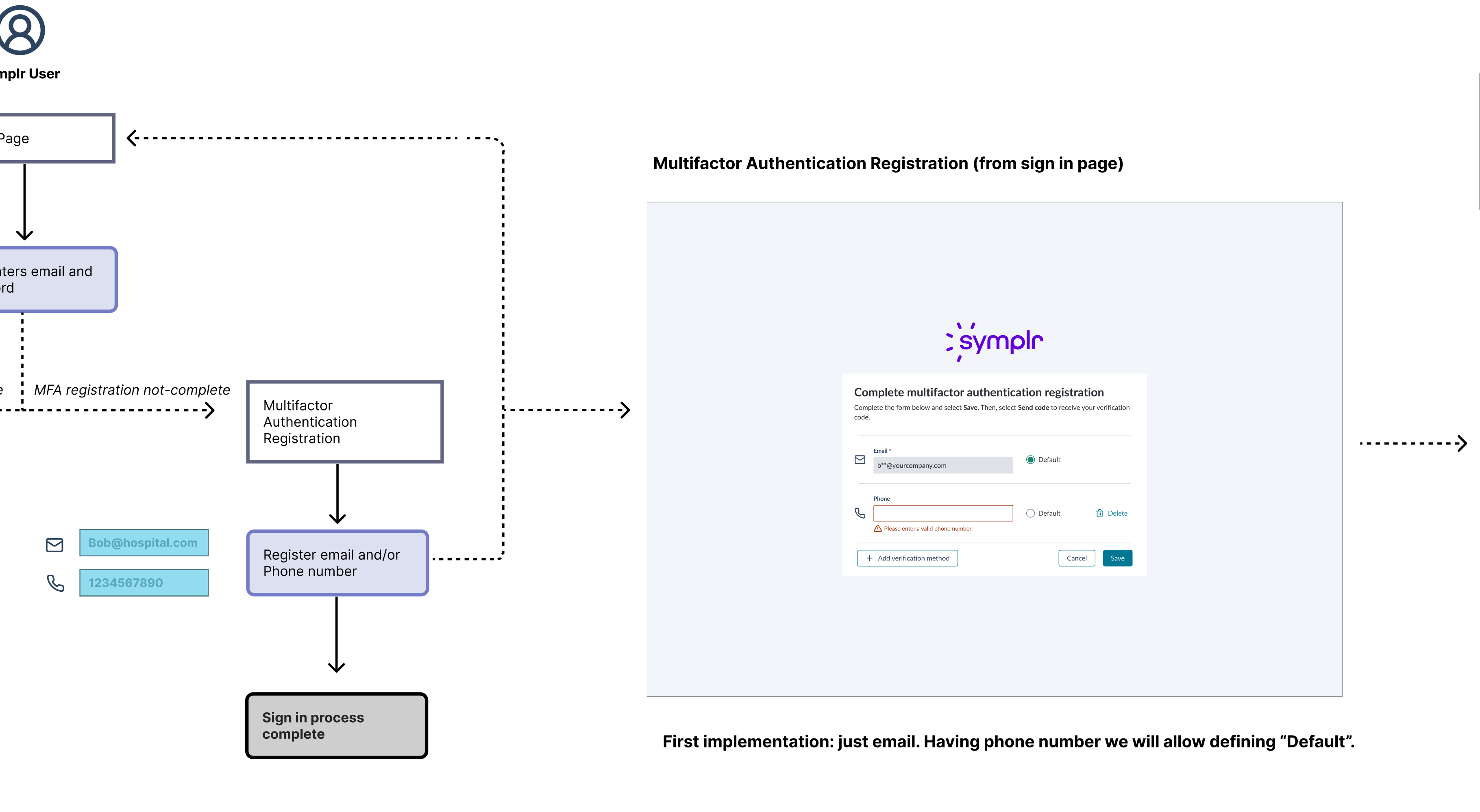
When the product requires multifactor authentication, users are prompted to complete registration during sign-in.
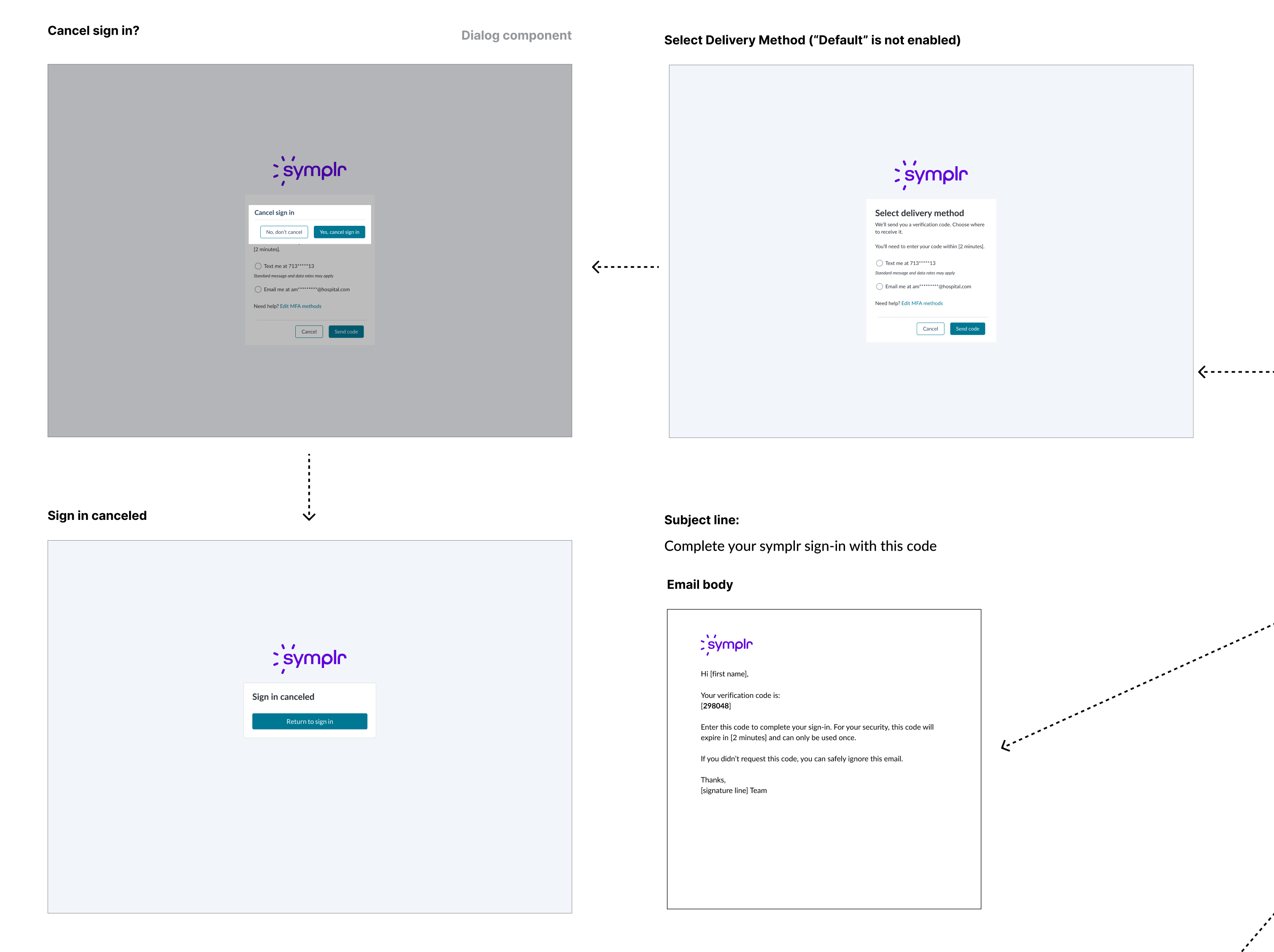
Users select how to receive their verification code or cancel the sign-in process.
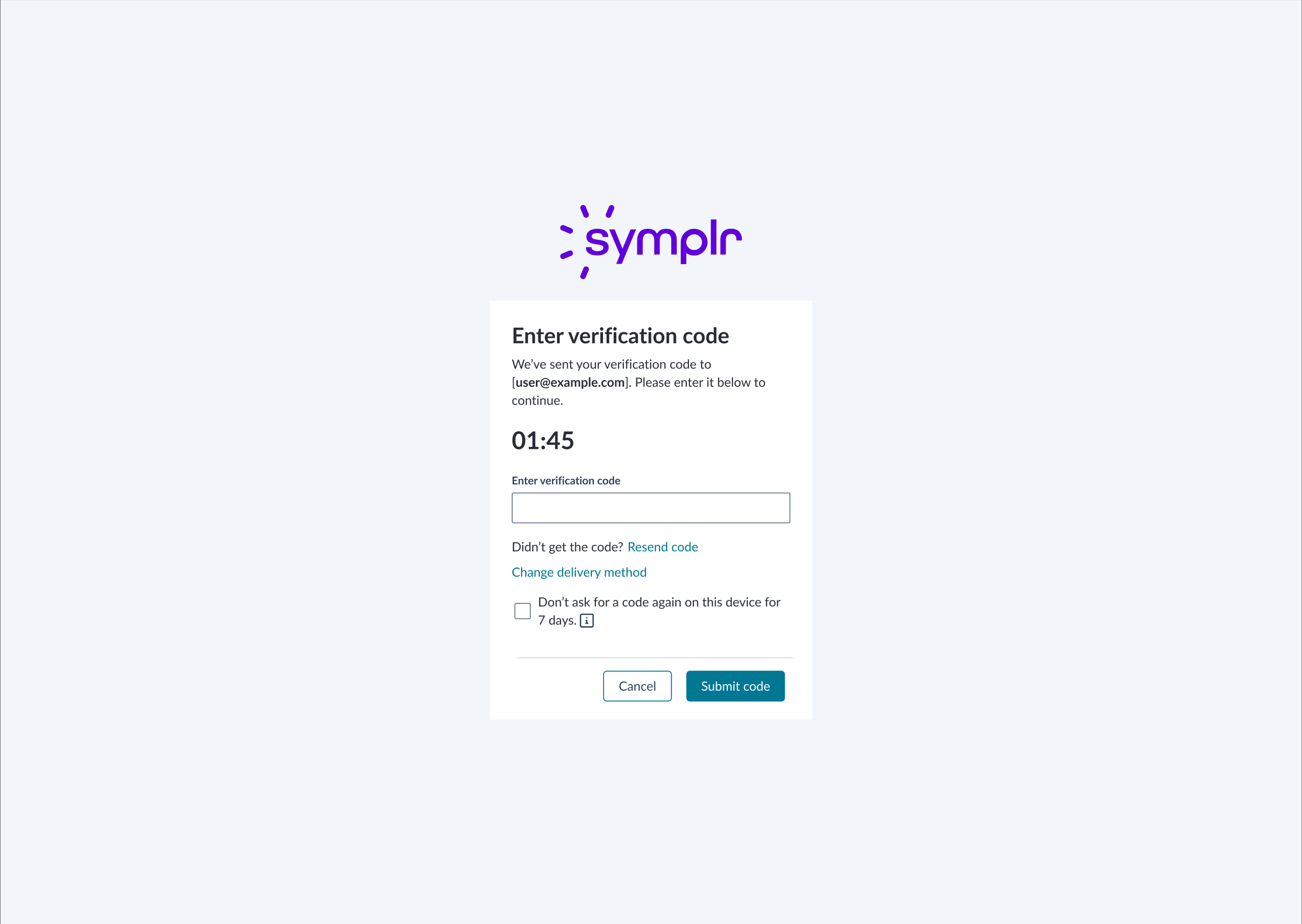
Code verification screens including resend and delivery method change options.
The universal sign-in and multifactor authentication patterns successfully unified fragmented authentication experiences across the product suite.
Phase 1 delivered a flexible sign-in solution in just 4 days that accommodated each product's unique requirements while establishing visual and interaction consistency.
Phase 2's standardized MFA flow provided users with a predictable, secure authentication experience regardless of which product they accessed.
This foundational work reduced user confusion, streamlined future authentication development, and advanced the multi-year initiative toward a seamless, universal identity experience across the entire platform.
"I must say—the designs were excellent. All the screens look great and align well with the requirements. I'm feeling good and excited about the progress."
— Prakash Naik, Staff Solutions Architect
This project was to revamp the clipping interface for the company's flagship product. By interviewing potential customers, we discovered that the original clipping interface was too complex to learn. After some competitor research and user testing, I designed a solution that met the users' needs. I added new panels at the bottom that visually showed the start and end clip points. Each panel allowed the user to easily move 1 second or 1 frame, forward or back, in the timeline. This allowed for frame accurate clip creation. I also added a play button to preview that portion of the clip. Feedback was very positive from customers and this new version of the clipping interface was implemented into the product.
February 2020
by Joel Gabiola
UX/UI, Interface