As Power BI adoption grew across our organization, we needed standardized UX guidance to ensure consistency and usability for internal teams and select product integrations.
I developed comprehensive guidelines that align Power BI implementations with our design system, covering information architecture, theming, visual design, accessibility, interactivity, and embedding strategies.
These guidelines enable teams to create user-friendly, accessible analytics experiences whether for internal use or embedded in our products.
Information Architecture (IA) is the critical UX foundation for effective Power BI reports and dashboards. Applying strong IA ensures users can effortlessly navigate complex data sets, quickly locate specific insights, and understand the relationship between different visuals and pages.
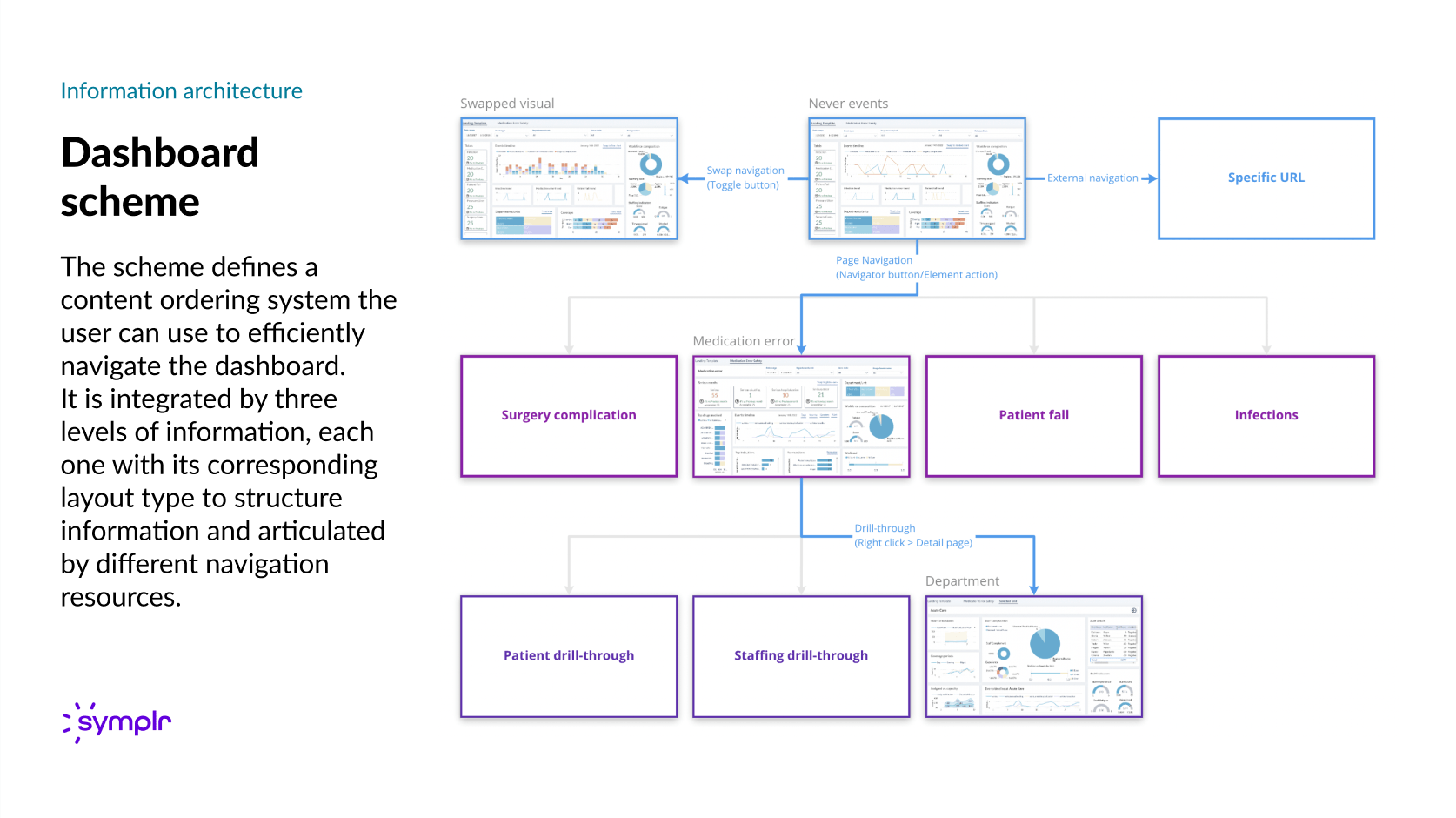
Dashboard IA Blueprint: Mapping the three levels of content structure and navigation (from high-level data to detail pages) to optimize user flow and information discovery.
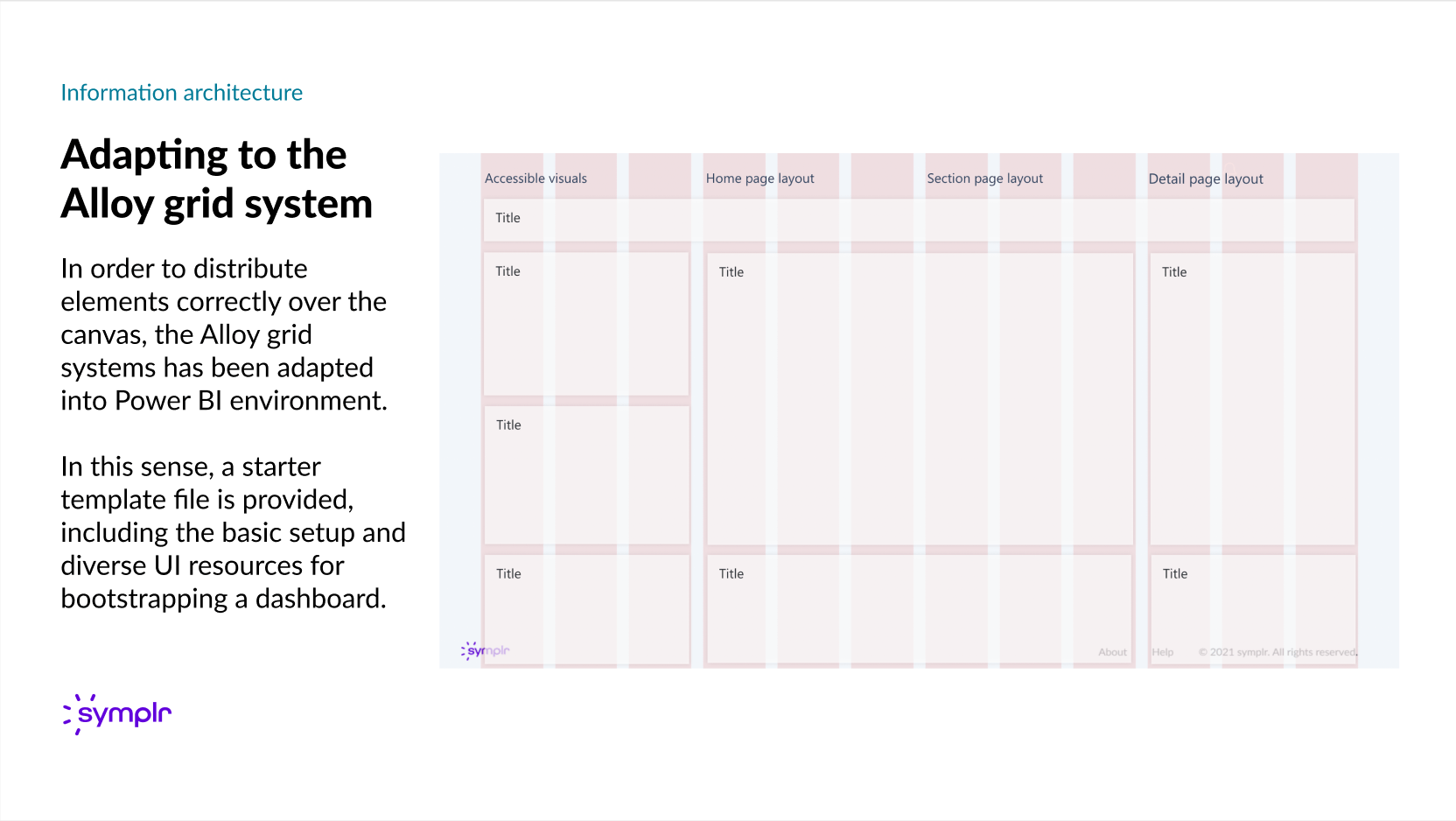
Adapting the existing Alloy grid system into the Power BI environment to ensure correct visual distribution and layout consistency across different report types (Home, Section, and Detail pages).

Visualizing the information architecture's three tiers through distinct layout types. Each template is structured to support different information densities—from high-level overviews (Home) to focused data exploration (Detail).
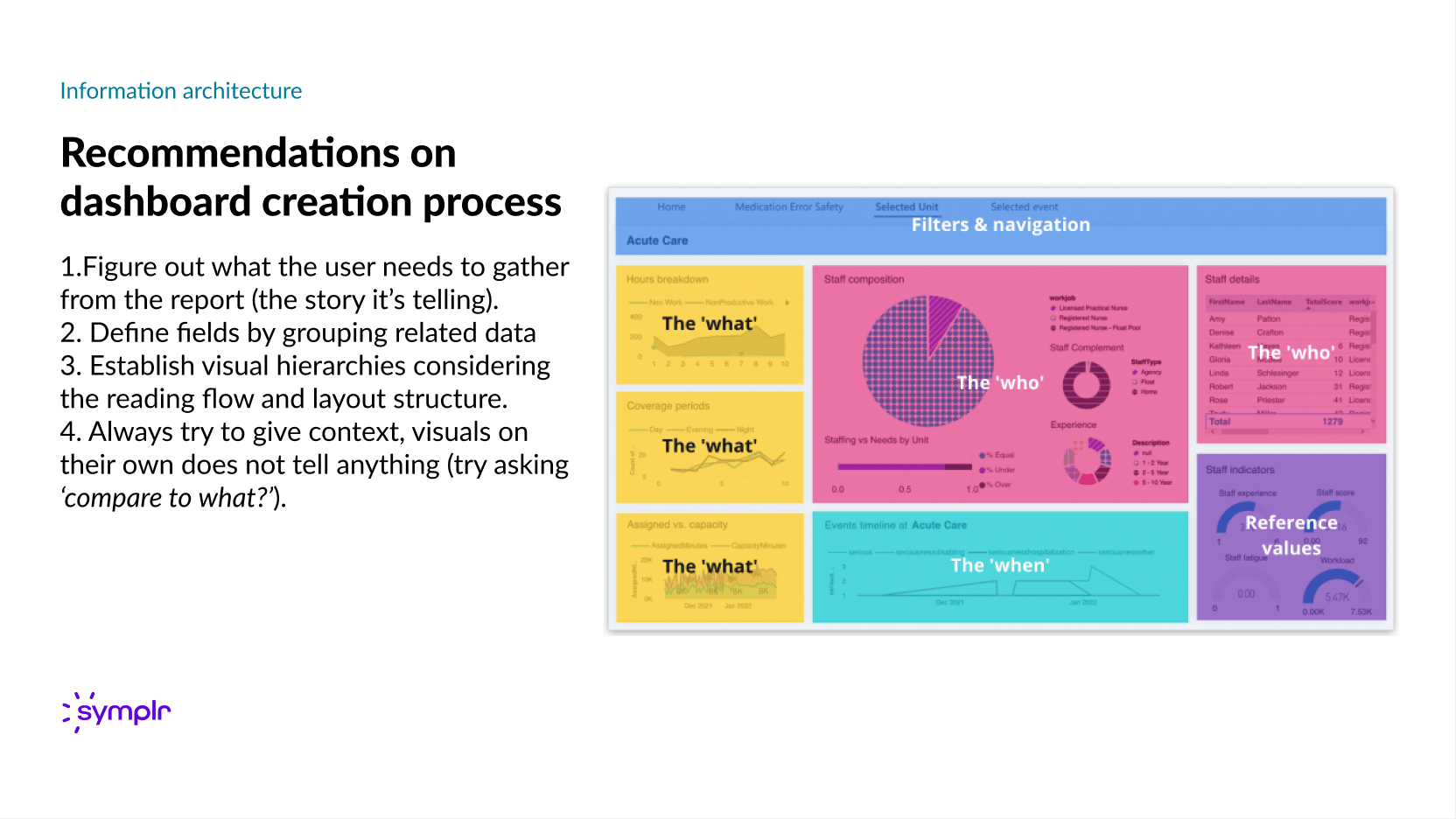
Summarizing the four-step design process, from defining the user's needs and data story to establishing visual hierarchies and providing essential context for actionable insights.
Theming Power BI reports with the established design system guarantees brand consistency, visual harmony, and a unified, professional user experience across the entire reporting ecosystem.
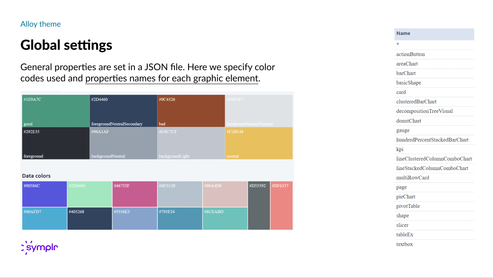
Visualization of the JSON configuration file for the custom Power BI theme (Alloy theme), detailing standardized color codes, semantic color definitions (e.g., 'good', 'bad'), and property names for every chart and graphic element.

Detailing the design and implementation of core UI components (Buttons, Badges, Cards, and Panels) within the theme. This includes documenting the properties set via the JSON pre-set, local property overrides, and specific UI limitations encountered within the Power BI environment.
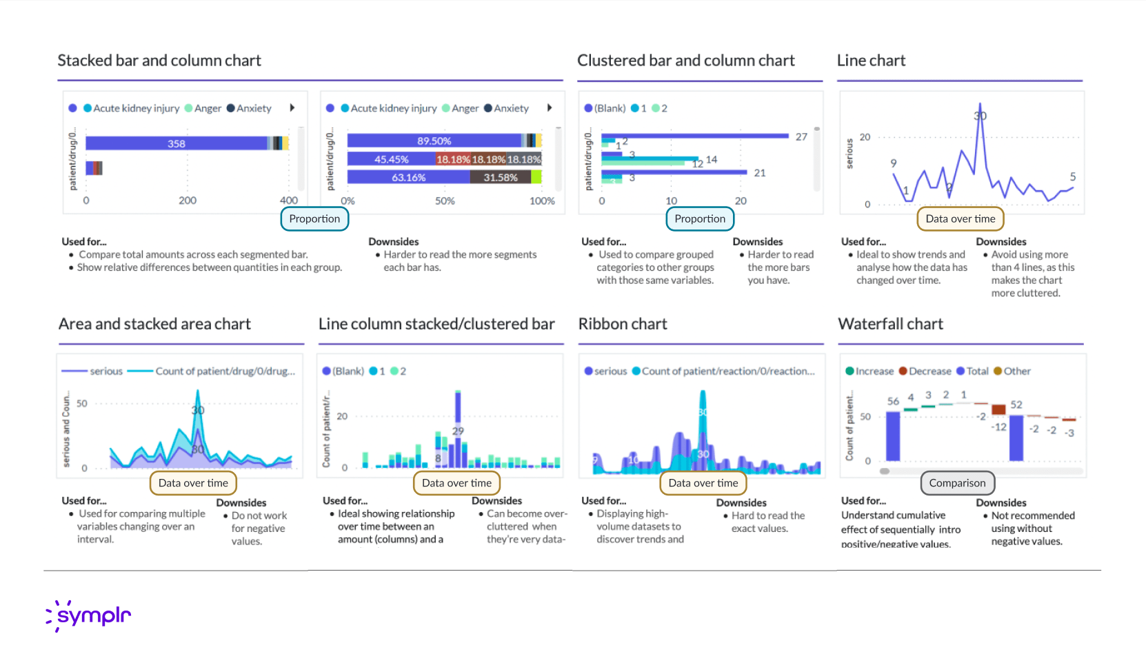
A guide to mindful visual selection based on user needs and the story the data must tell. This framework categorizes visuals by function (e.g., Comparisons, Hierarchy, Data over time) to ensure the most appropriate chart is chosen for the context.
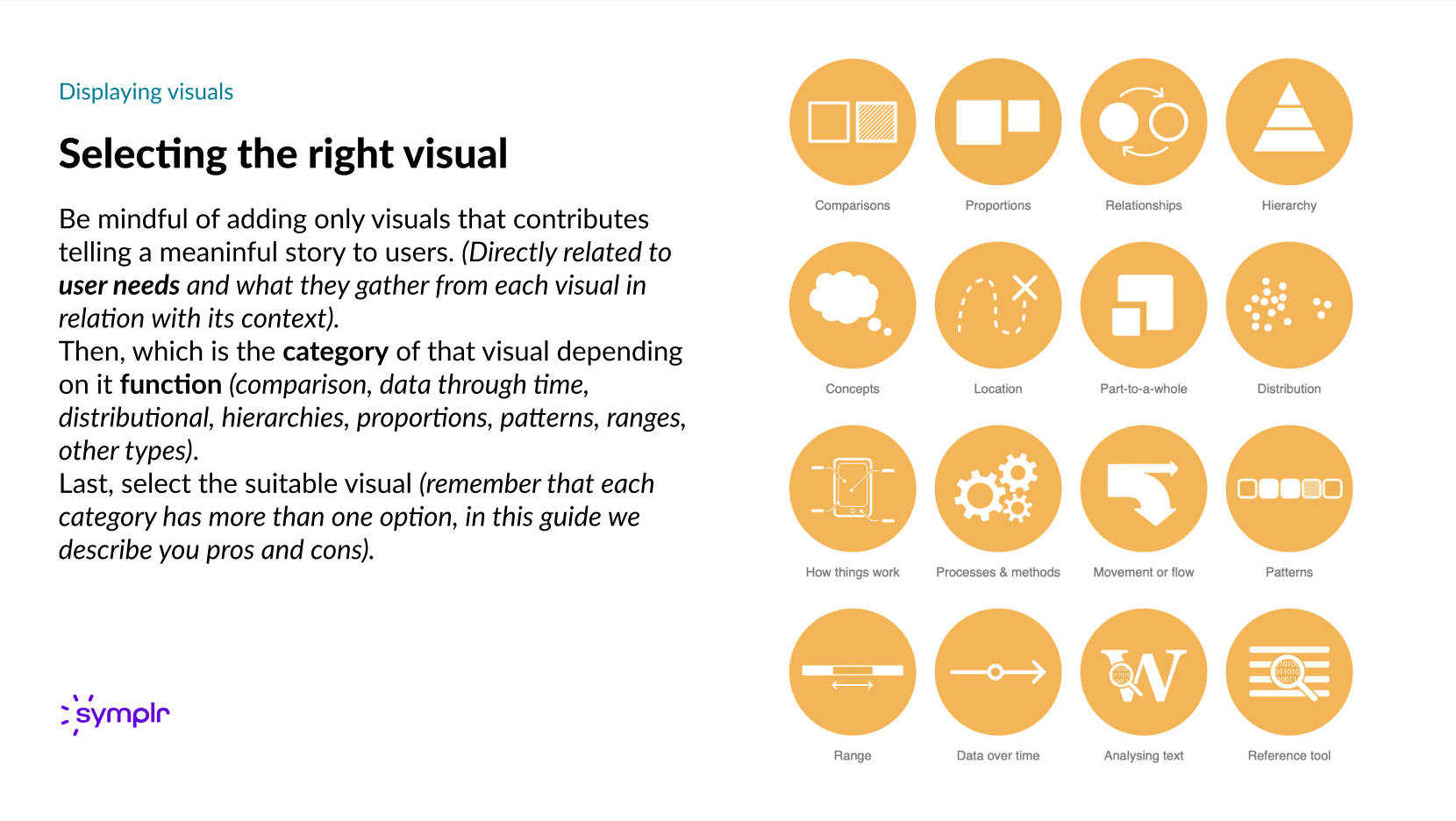
The process ensures that every chosen visual directly addresses user needs and aligns with its functional category to enhance meaning and context.
Detailed overview of specific visualizations—including Stacked Bar, Line, Ribbon, and Waterfall charts—outlining their optimal use cases (e.g., Proportion, Data over time, Comparison) alongside documented downsides and cautionary usage notes for designers and report creators.
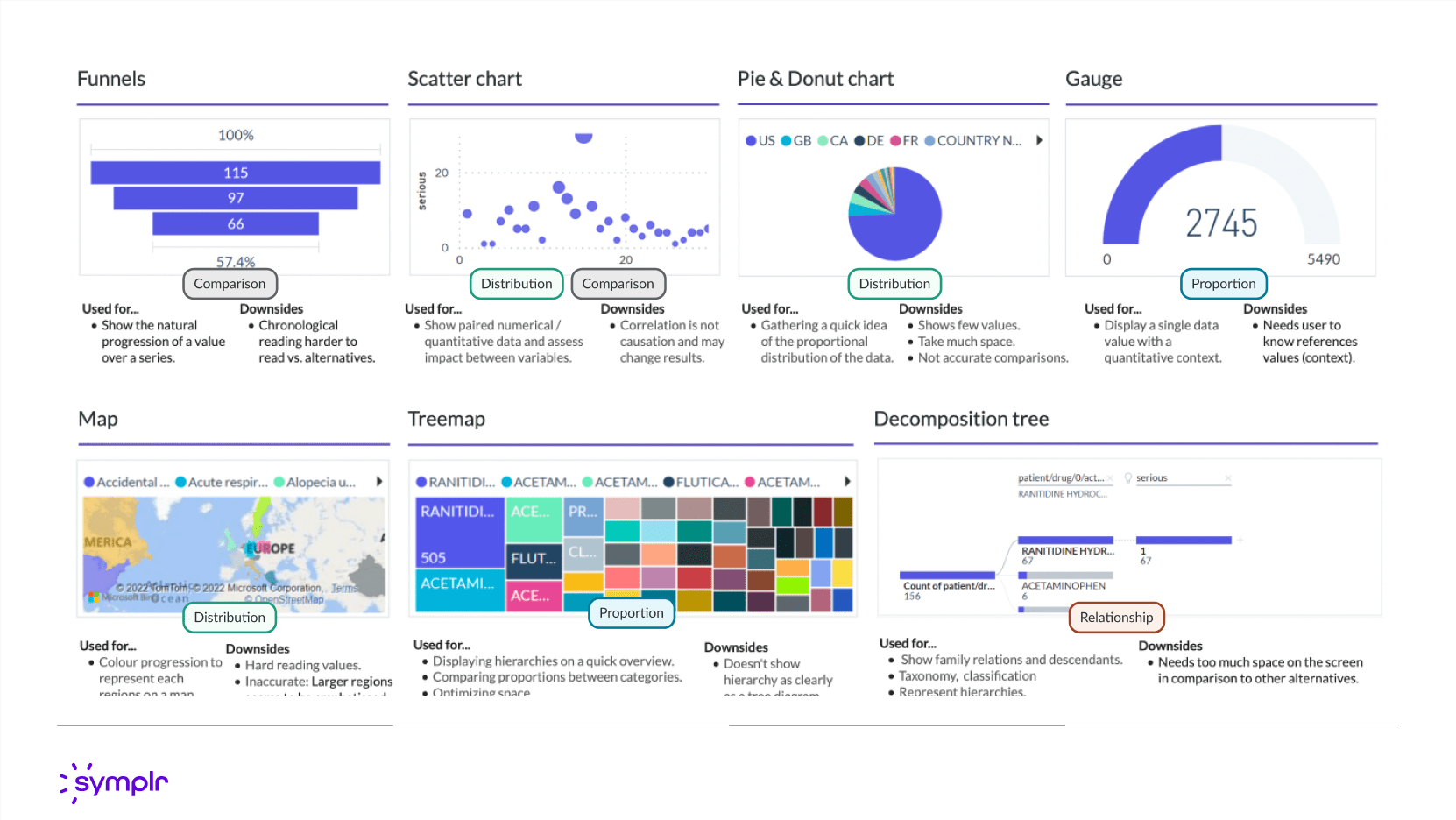
Further documentation on specialized chart types—including Funnels, Scatter charts, Treemaps, and Decomposition Trees—specifying their application (e.g., Comparison, Distribution, Proportion, Relationship) and listing known downsides to guide effective data presentation.
Accessibility ensures all Power BI reports and dashboards can be effectively consumed by everyone, including users with disabilities.
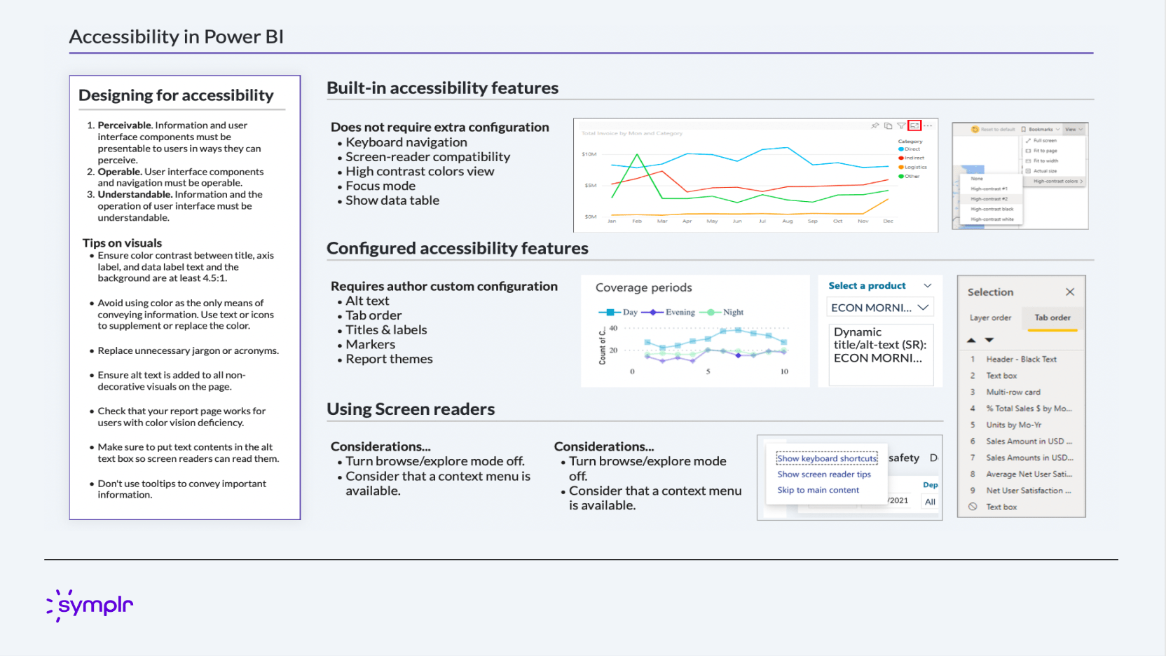
A comprehensive guide outlining the built-in, configurable, and design-level features required for accessible reports. This includes standards for perceivable, operable, and understandable content, tips on visuals (color contrast, Alt text), and considerations for effective use with screen readers and keyboard navigation.
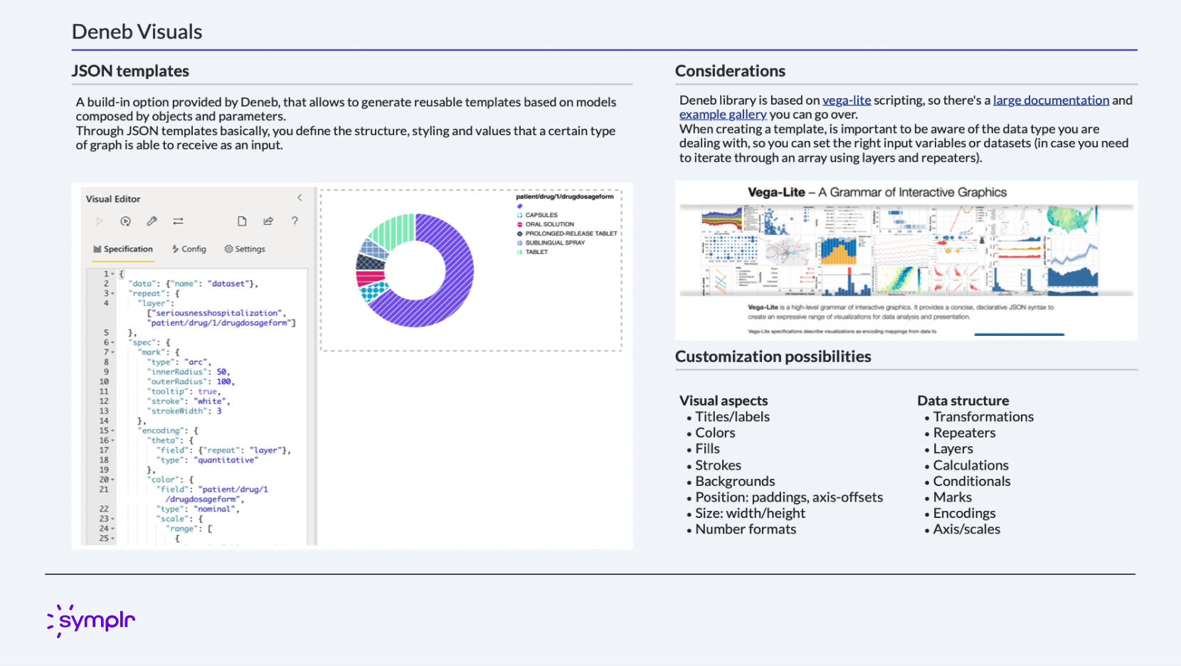
Documentation on leveraging the Deneb library and Vega-Lite scripting to create highly customized, reusable JSON templates for data visualization. This approach grants granular control over visual properties, data structures, and interactions not available in standard Power BI visuals.
The implementation of this comprehensive UX guidance—covering Information Architecture, Visual Theming (via the Design System), and Accessibility Standards—resulted in a significant improvement in the usability and consistency of internal reporting.
By standardizing report layouts and defining a clear three-tiered navigation scheme, user effort to locate and interpret data was dramatically reduced. The deployment of the custom theme ensured brand consistency across all new dashboards, eliminated visual discrepancies, and provided an accessible foundation (WCAG compliant colors and improved Tab order) that expanded the audience who could effectively utilize business intelligence insights.
This effort successfully transformed Power BI from a collection of disparate reports into a cohesive, scalable, and inclusive data ecosystem.
This project was to revamp the clipping interface for the company's flagship product. By interviewing potential customers, we discovered that the original clipping interface was too complex to learn. After some competitor research and user testing, I designed a solution that met the users' needs. I added new panels at the bottom that visually showed the start and end clip points. Each panel allowed the user to easily move 1 second or 1 frame, forward or back, in the timeline. This allowed for frame accurate clip creation. I also added a play button to preview that portion of the clip. Feedback was very positive from customers and this new version of the clipping interface was implemented into the product.
February 2020
by Joel Gabiola
UX/UI, Interface