When data moves between enterprise products, each step is tracked through our Connected Enterprise middleware. If something fails, detailed logs capture exactly what happened and where.
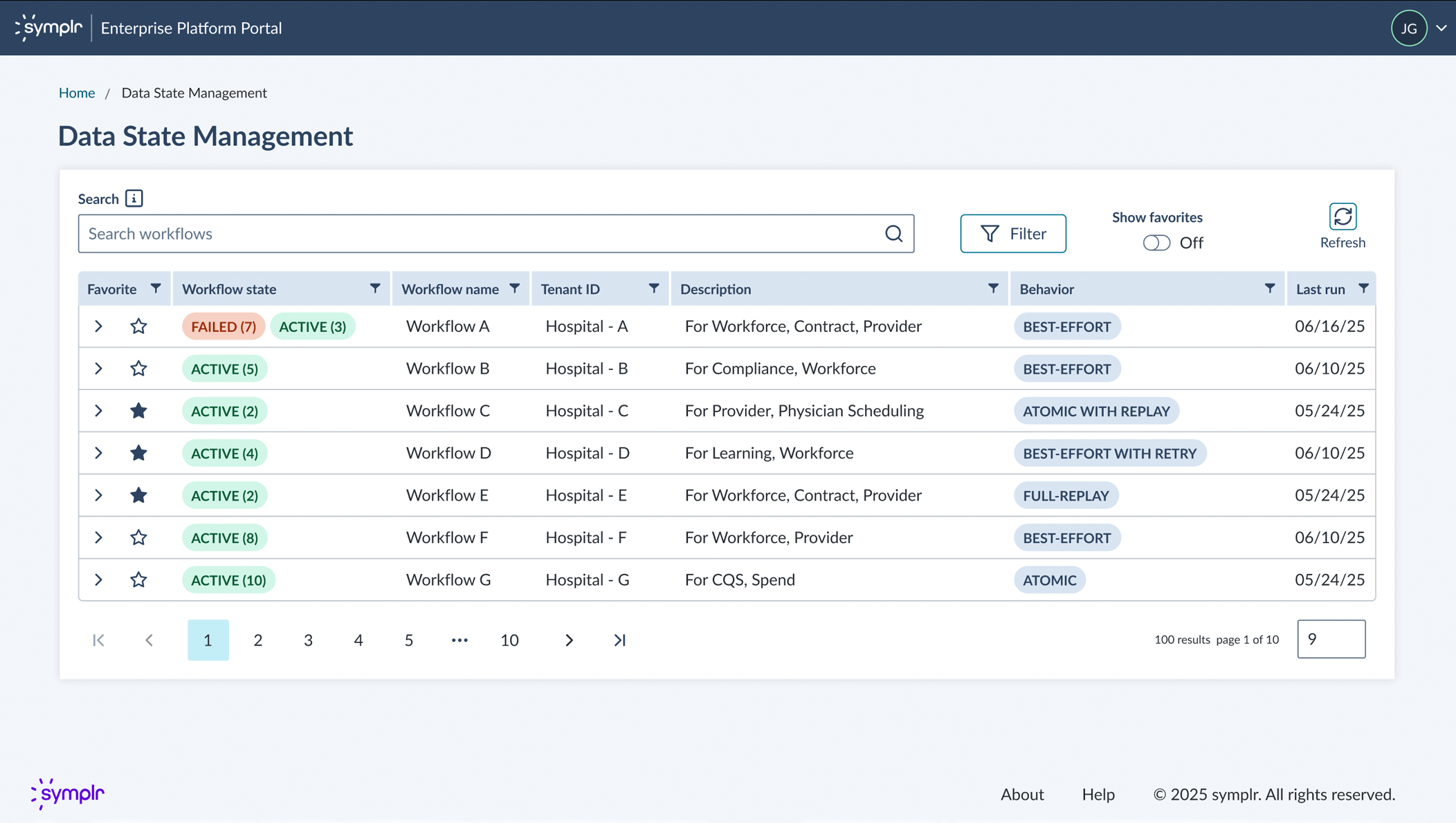
I designed a UI that helps internal teams quickly visualize and debug these data flows. The interface lets administrators search workflows by name, see the sequence of steps, and pinpoint integration failures—making troubleshooting faster and more intuitive.
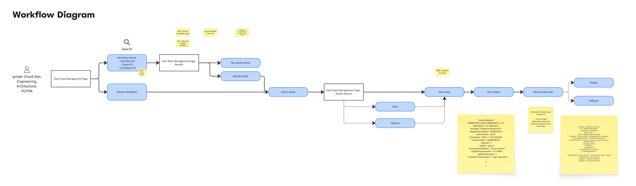
Collaborated with cross-functional stakeholders to map the user journey and define requirements. This flow diagram captures the high-level screens, key information needed at each step, and actions users take to diagnose issues. Primary users: Cloud Ops, Engineering, Architecture, and Product teams.
Early wireframes facilitated collaborative discussions with stakeholders to define requirements and explore solutions. This iterative, back-and-forth process helped us align on functionality and user flows before moving to higher-fidelity designs.
Wireframes exploring the details screen for an integrated workflow. Presenting multiple options sparked conversations about technical feasibility and scope—helping the team prioritize what to build now versus future phases.
Designed for quick scanning: administrators can instantly identify failed workflows across multiple integrations without digging into details.
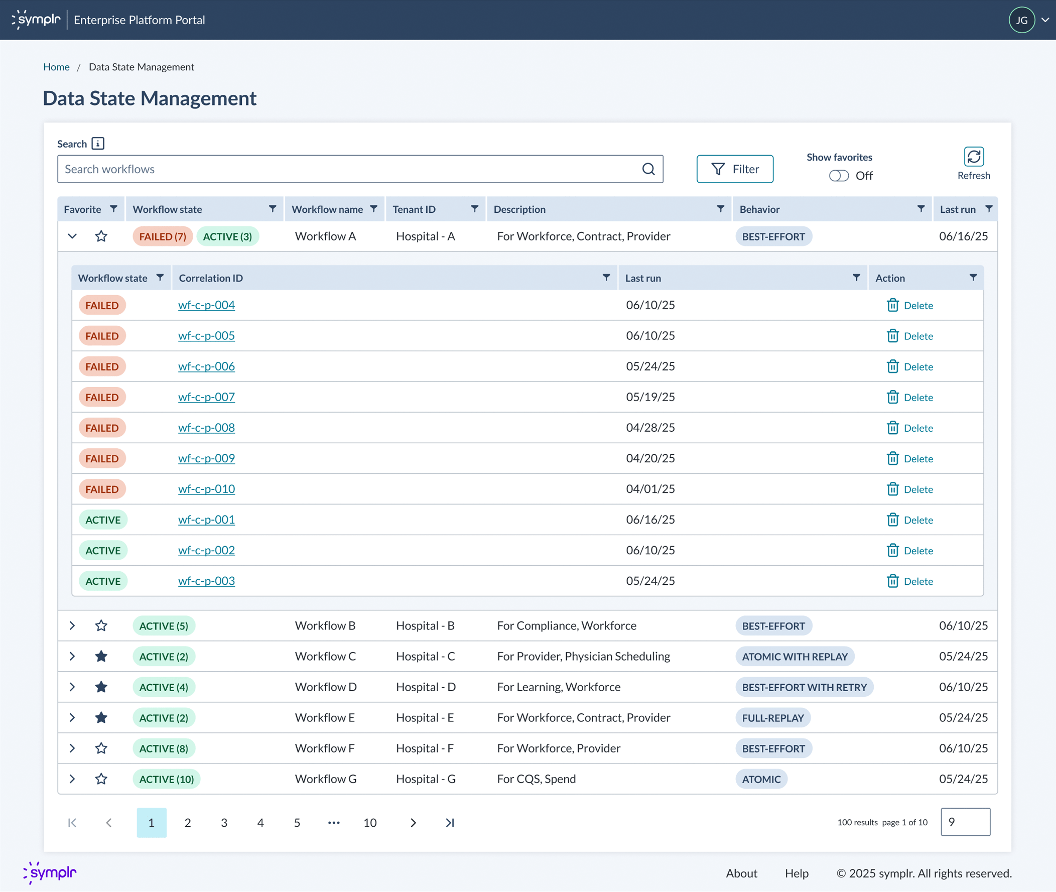
Expandable rows reveal sub-workflow instances at a glance. Failed workflows are clearly marked, and users can click directly into details for troubleshooting.
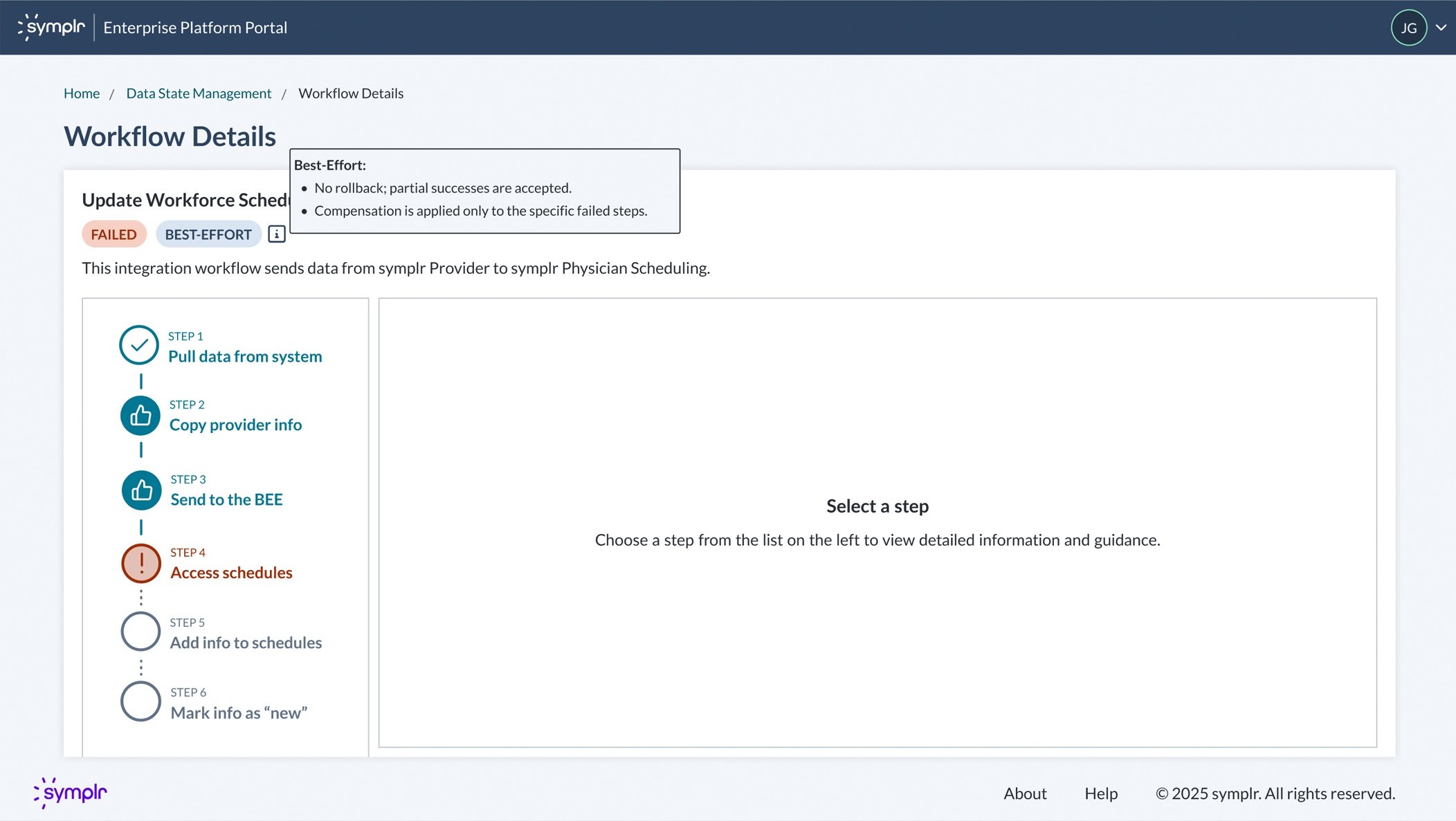
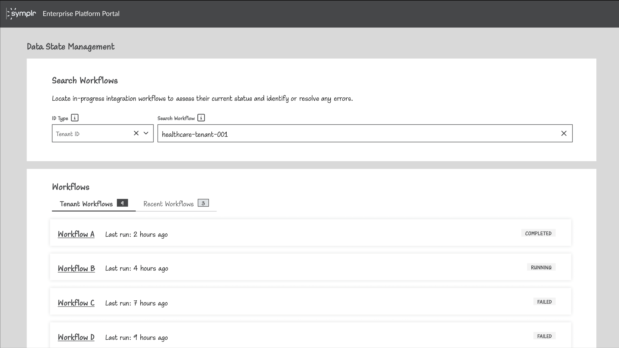
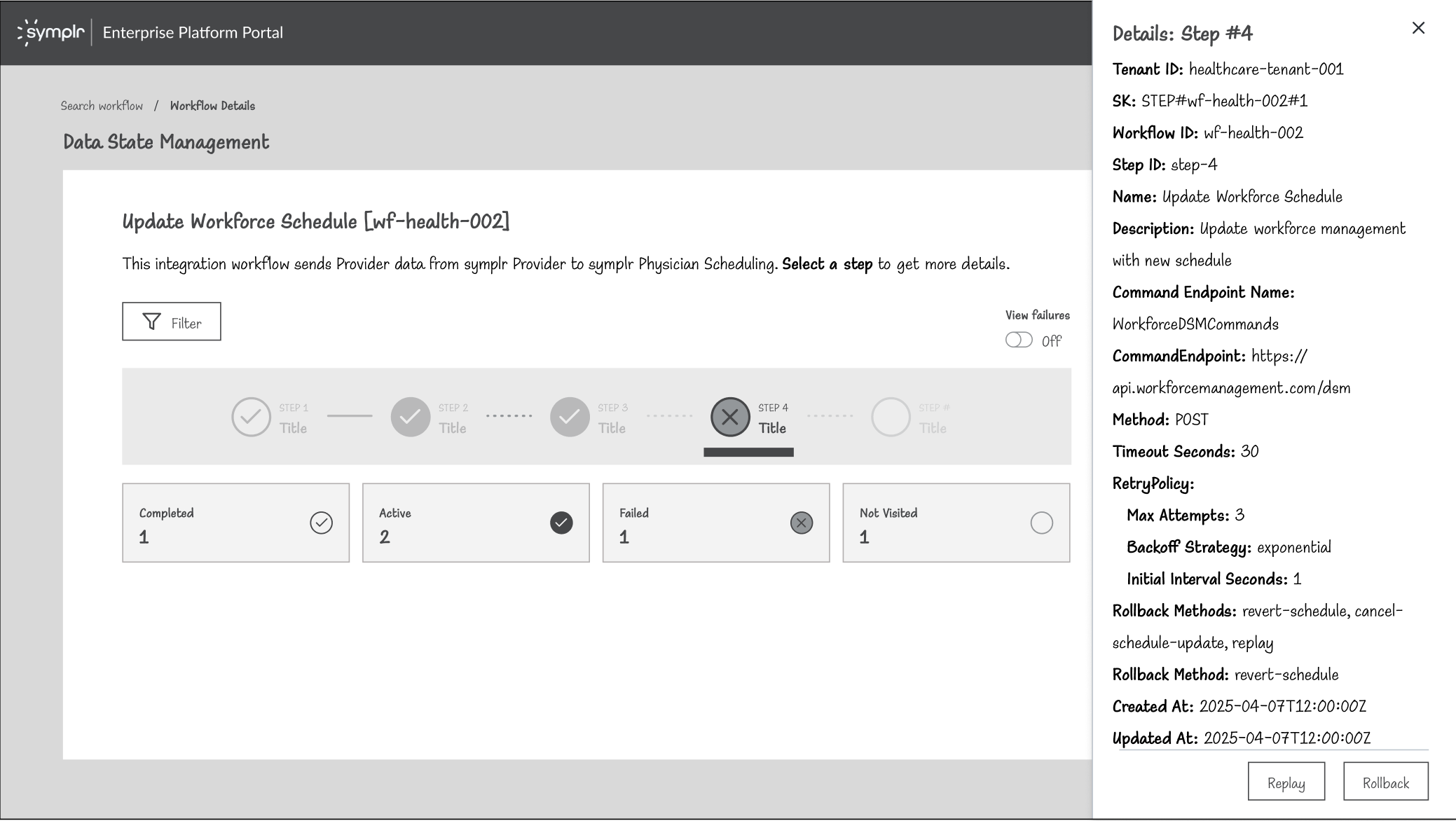
Clicking into a workflow reveals its step-by-step progression and diagnostic information to troubleshoot issues.
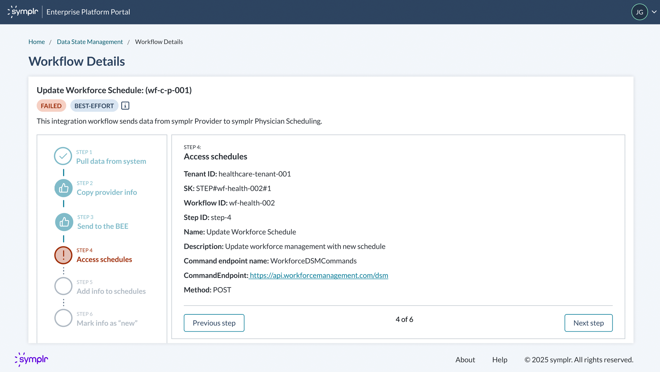
Users can click on each step to view metadata for troubleshooting. Phase one focused on visibility and diagnostics—phase two will introduce replay and rollback capabilities to resolve errors directly.
The design delivered a centralized tool that gives internal teams clear visibility into cross-product data flows and failure points. The workflow visualization streamlines troubleshooting by surfacing diagnostic metadata at each step, reducing the time teams spend manually tracing issues across systems.
The save/pin feature improves efficiency for Cloud Ops managing recurring workflows, while the scalable design handles integrations with 100+ steps. Design system contributions—including the vertical stepper and grid integration—created reusable patterns for future enterprise tools.
This project was to revamp the clipping interface for the company's flagship product. By interviewing potential customers, we discovered that the original clipping interface was too complex to learn. After some competitor research and user testing, I designed a solution that met the users' needs. I added new panels at the bottom that visually showed the start and end clip points. Each panel allowed the user to easily move 1 second or 1 frame, forward or back, in the timeline. This allowed for frame accurate clip creation. I also added a play button to preview that portion of the clip. Feedback was very positive from customers and this new version of the clipping interface was implemented into the product.
February 2020
by Joel Gabiola
UX/UI, Interface