Avoid duplicate providers (i.e. doctors) and vendors in the system.
Users who initiate workflows need a solution that doesn't block them from starting contract workflows. Admins are charged with finding and eliminating duplicate vendors and providers in the system to avoid "impossible days" (billing more than 24 hrs) and unintentionally not being compliant with the STARK* law. Eventual large fines and not being allowed to bill Medicare could be the result.
*STARK law prohibits practitioners from making improper referrals when there is a conflicting financial interest.
Project Type: Contract Management
Designed for: Desktop
Stakeholders: 3
Product Owner: 1
UX Designer: 1 (me)
My role was to create a solution that balances the desire to initiate contract workflows with the need of avoiding the creation of duplicate (Provider/Vendor) records.
There are two sides to this workflow and each has it's own priorities.
Users that initiate contract workflows prioritize completing workflows and need a solution that doesn't block them from completing their tasks.
Admins want to avoid creating duplicate records (Providers or Vendors) in the system because duplicate records could lead to severe fines or the hospital going out of business because they are in violation of the STARK law.
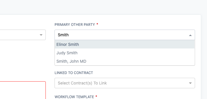
In the original interface, users typed in the name of a Provider or Vendor in the "Primary Other Party" typeahead field to see if there is an existing record in the system.
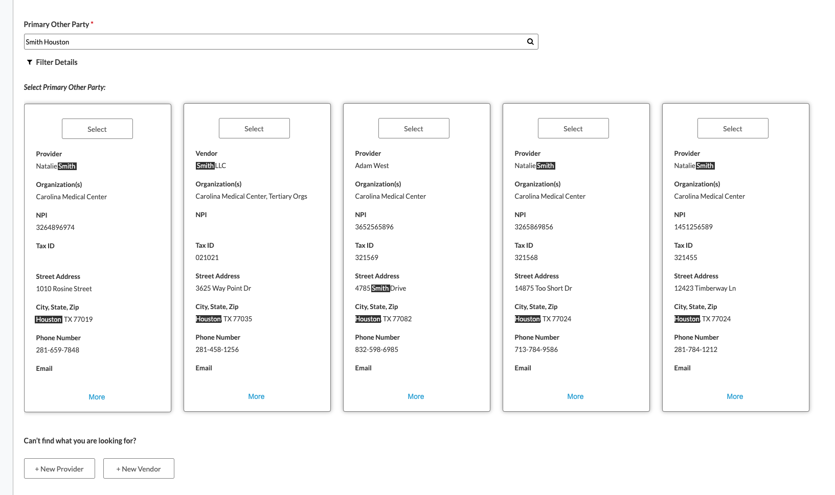
We replaced the typeahead with an advance search field. Now, the user can search on multiple keywords and search across multiple data fields in the system.
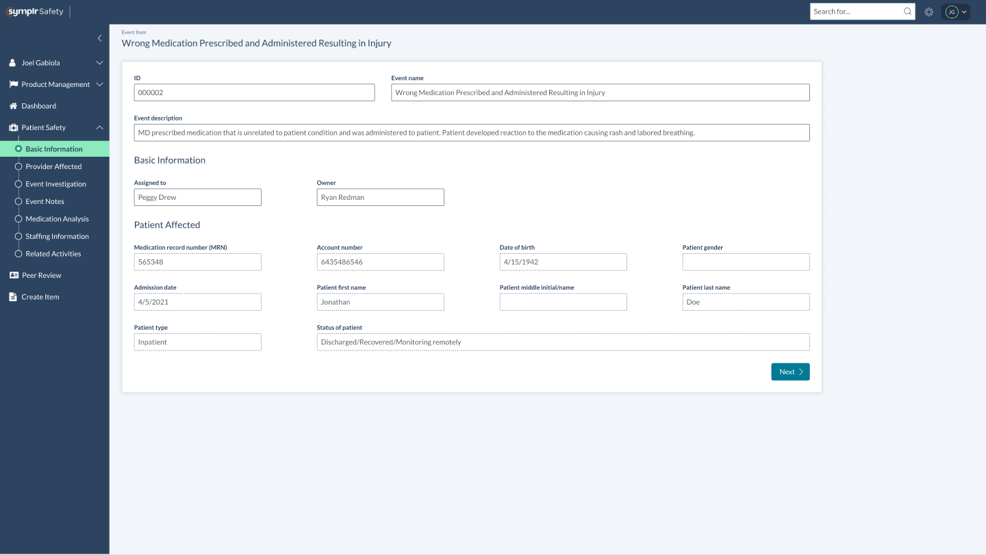
With the investigation phase, I wanted to incorporate the ability to automatically pull information from the incident report to make the investigation process more efficient, but to also prevent errors. I also separated each step in the investigation in Safety into logical steps with a indicator on the left navigation to easily give the user a sense of place.

For the provider affected section, I added the ability to pull the provider's history to see if, in this example, the person has a high rate of medication error events. I also added a "view full history report" button to access their full history report in the Quality system.

For the medication analysis section, we automatically pull the medication information directly from the EMR. To access the full EMR, you can click the "view EMR" button in the top right.
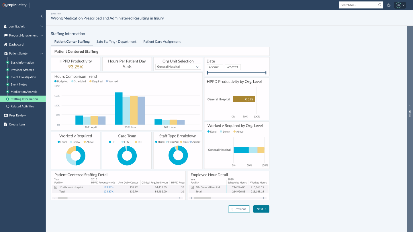
We've integrated Power BI into the investigation workflow so the investigator to easily see staff analytics of when the medication error happened. It includes a staff breakdown and if the patient received the appropriate amount of care.
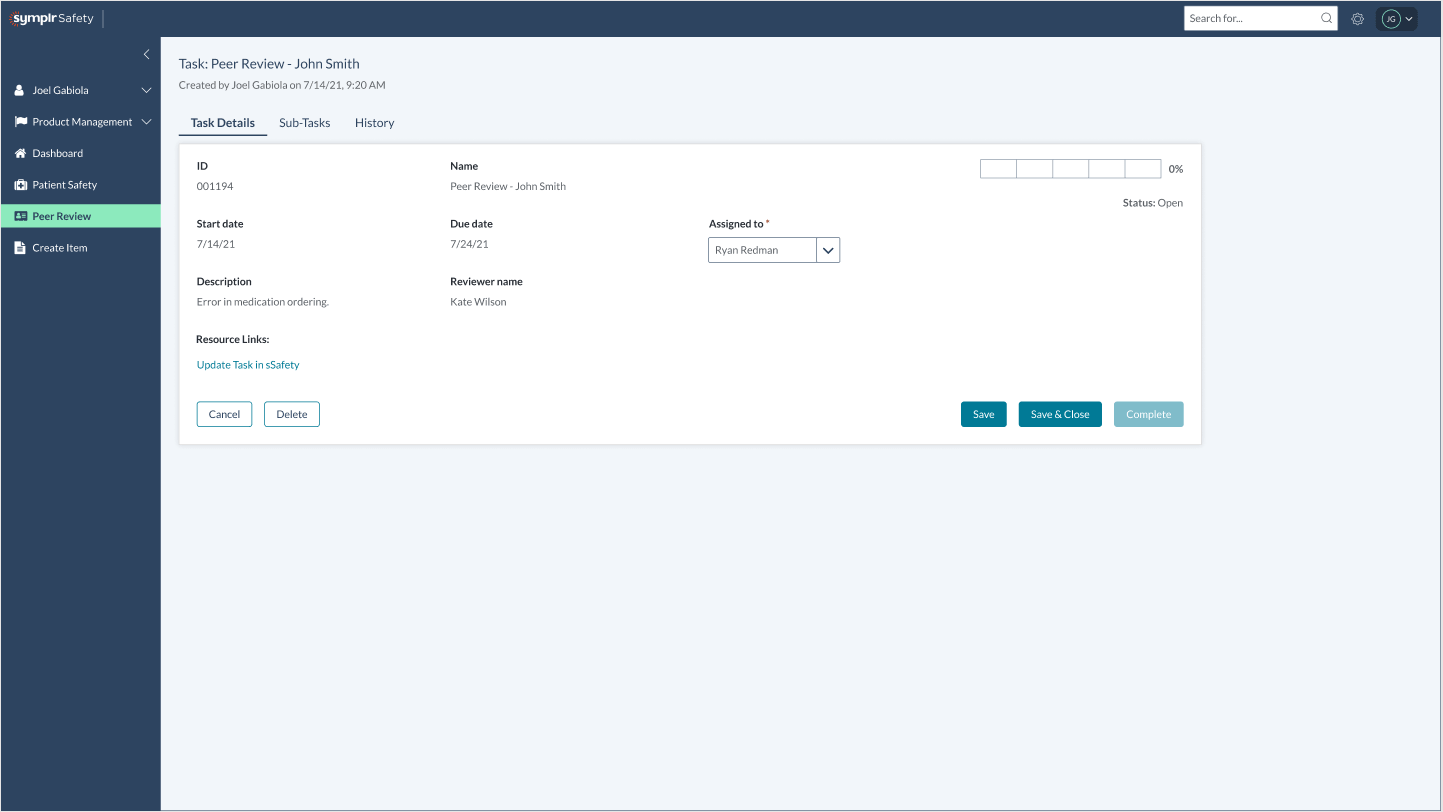
The investigator in Safety now has the ability to create tasks for people in different products. In this example, we are creating a task for the Quality Director to conduct a Peer Review.
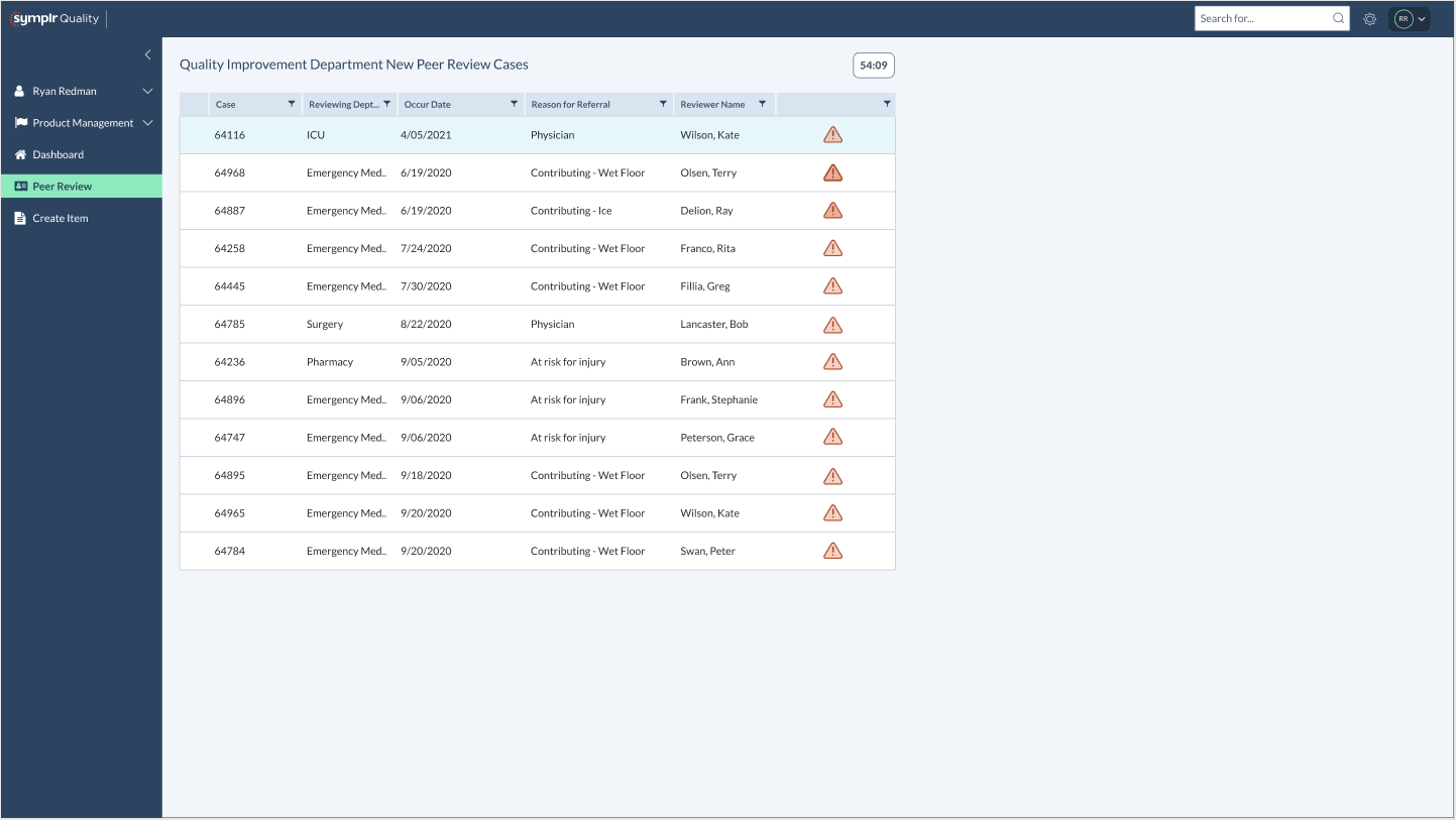
In the Quality product, a case is automatically generated with the incident report already attached.
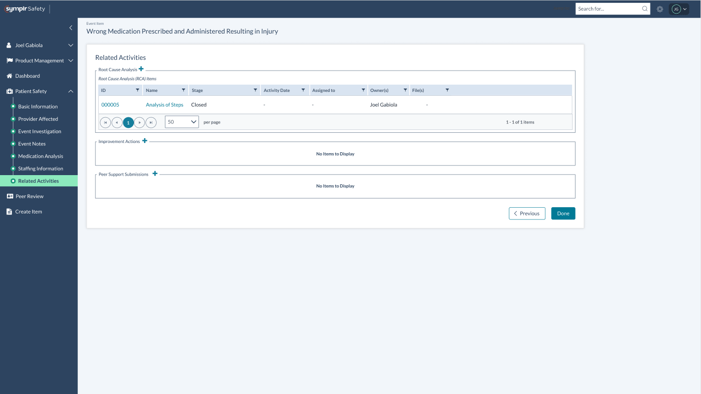
Once the Peer Review is completed, the results the case is set to "closed."
An interactive mockup was created and presented for approval. The project was approved for funding with the plan to build the necessary integration between solutions in order to upsell the advantages of owning the complete ecosystem of products.
This project was to revamp the clipping interface for the company's flagship product. By interviewing potential customers, we discovered that the original clipping interface was too complex to learn. After some competitor research and user testing, I designed a solution that met the users' needs. I added new panels at the bottom that visually showed the start and end clip points. Each panel allowed the user to easily move 1 second or 1 frame, forward or back, in the timeline. This allowed for frame accurate clip creation. I also added a play button to preview that portion of the clip. Feedback was very positive from customers and this new version of the clipping interface was implemented into the product.
February 2020
by Joel Gabiola
UX/UI, Interface