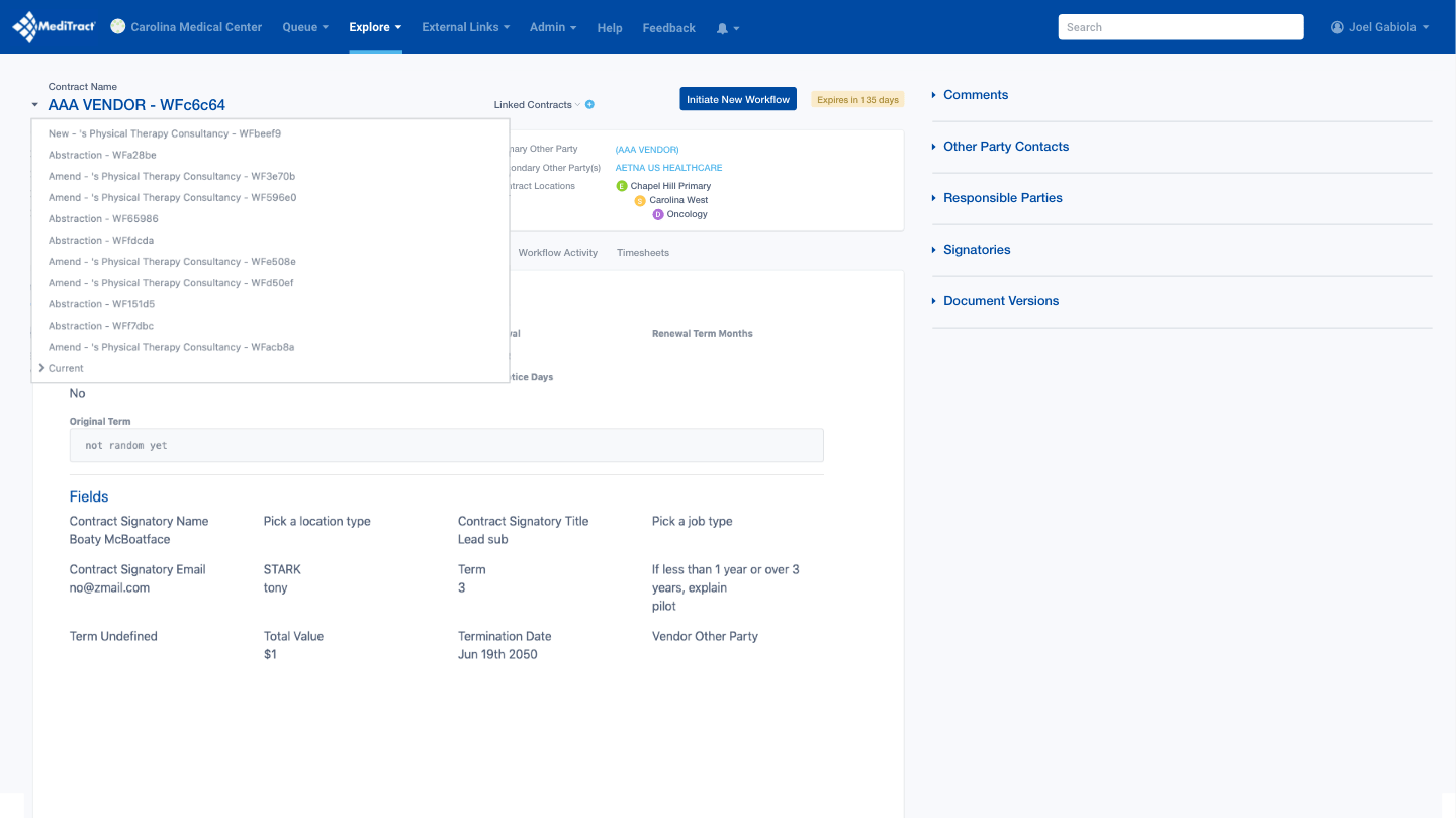
Designed a unified view that shows how multiple healthcare contracts interact. Users gain visibility into each contract's phase, ownership, progress, and version status—eliminating the need to navigate multiple screens for critical information.
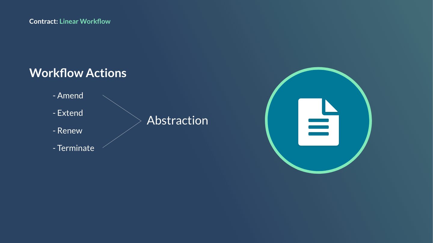
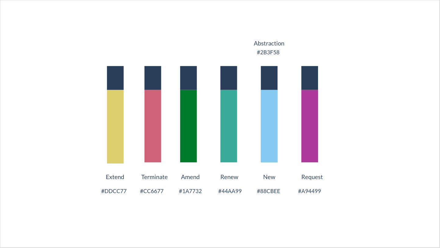
Common contract workflow actions include amending, extending, renewing, and terminating. An optional abstraction step allows off-site teams to review and finalize contracts.
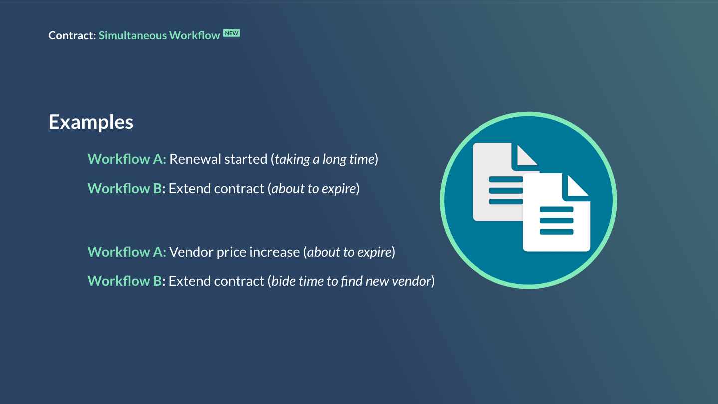
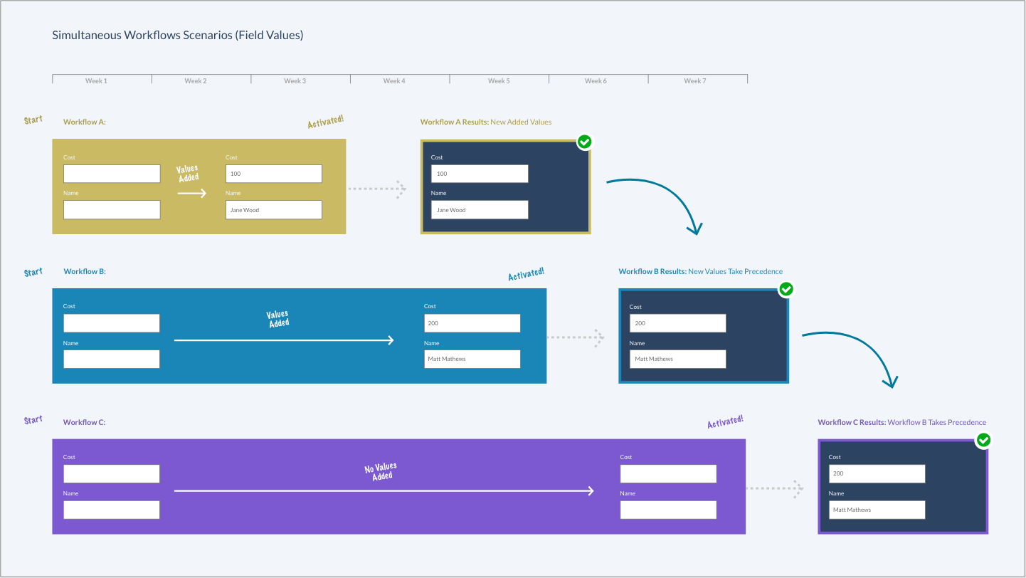
Simultaneous workflows enable hospitals to extend expiring contracts while renewal negotiations are still underway.
I started by identifying what information users struggled to access.
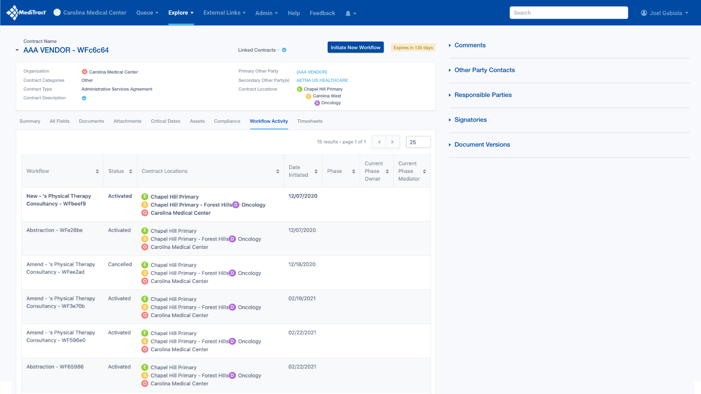
Users can view contract lists but lack visibility into contract relationships and dependencies.
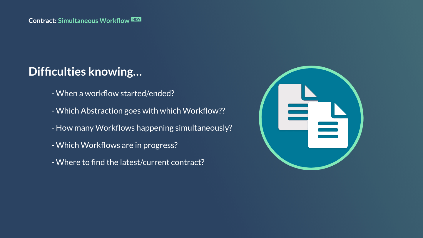
When defining rules for simultaneous workflows, we addressed what happens when multiple workflows update the same fields. The solution: the most recent update becomes the current value. Additionally, blank fields never overwrite populated fields from other workflows—ensuring information isn't accidentally lost.
Since the design relies on semantic colors to convey meaning, we ensured the palette was colorblind-safe. User research and testing validated the final color selections.
Through user testing sessions observing participants interact with the new design, we gathered valuable insights. Participants valued the timeline visualization and detailed card information, noting it provided clear visibility into contract activity.
They requested additional workflow data points—such as when reviews were requested and completed. However, the zoom functionality created friction; users found the zoom bar difficult to use and questioned its necessity.
Final design incorporating user testing insights.
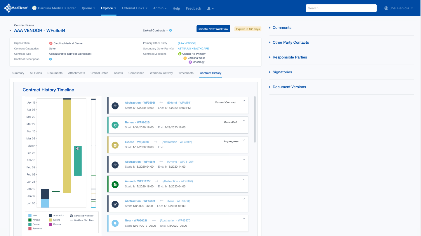
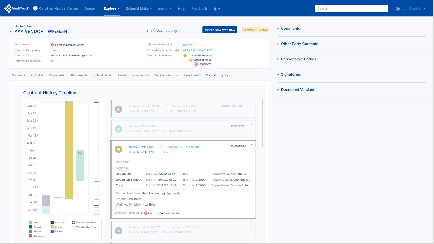
Through multiple rounds of user testing, we developed an interactive timeline solution that provides comprehensive contract visibility. The left-side timeline shows all workflows and their relationships at a glance, while clicking any timeline bar expands the corresponding card on the right—giving users complete contract details.
This dual-view approach balances high-level overview with on-demand depth, solving the core challenge of understanding complex, simultaneous contract workflows.
This project was to revamp the clipping interface for the company's flagship product. By interviewing potential customers, we discovered that the original clipping interface was too complex to learn. After some competitor research and user testing, I designed a solution that met the users' needs. I added new panels at the bottom that visually showed the start and end clip points. Each panel allowed the user to easily move 1 second or 1 frame, forward or back, in the timeline. This allowed for frame accurate clip creation. I also added a play button to preview that portion of the clip. Feedback was very positive from customers and this new version of the clipping interface was implemented into the product.
February 2020
by Joel Gabiola
UX/UI, Interface