Healthcare provider shortages are delaying patient care, and credentialers face time-consuming workflows to ensure qualified providers are ready for monthly committee reviews. I designed a "concept car" prototype—a 5-10 year vision of the credentialing workflow—to explore how we could solve critical pain points like manual processes, missed deadlines, and redundant verifications. This prototype tests bold ideas and generates stakeholder excitement without the constraints of near-term production requirements.
The current credentialing interface. Over the years, we've heard feedback from users about what isn't working.

Through research, we uncovered credentialers' biggest pain points, critical blockers, and the workarounds they've built to get their jobs done.
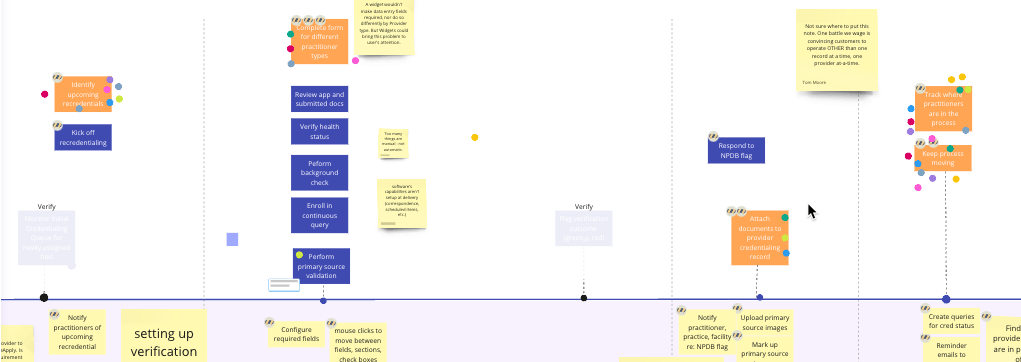
We focused on the 5 most critical workflows credentialers use daily.
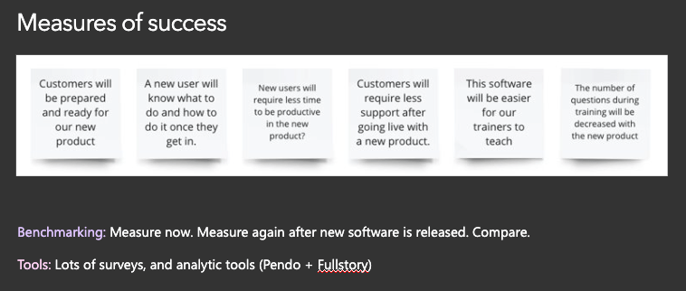
We defined success metrics and data collection methods to measure how workflow improvements would impact credentialer efficiency and patient care outcomes.
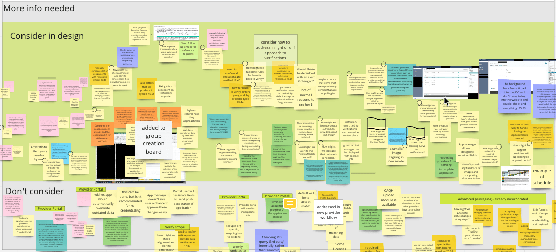
For each of the documented pain points, we asked:
Critical pain points impacting credentialers and leadership:
Facilitated a vision workshop to define the future direction of credentialing. This vision statement serves as a north star for evaluating and aligning future initiatives.
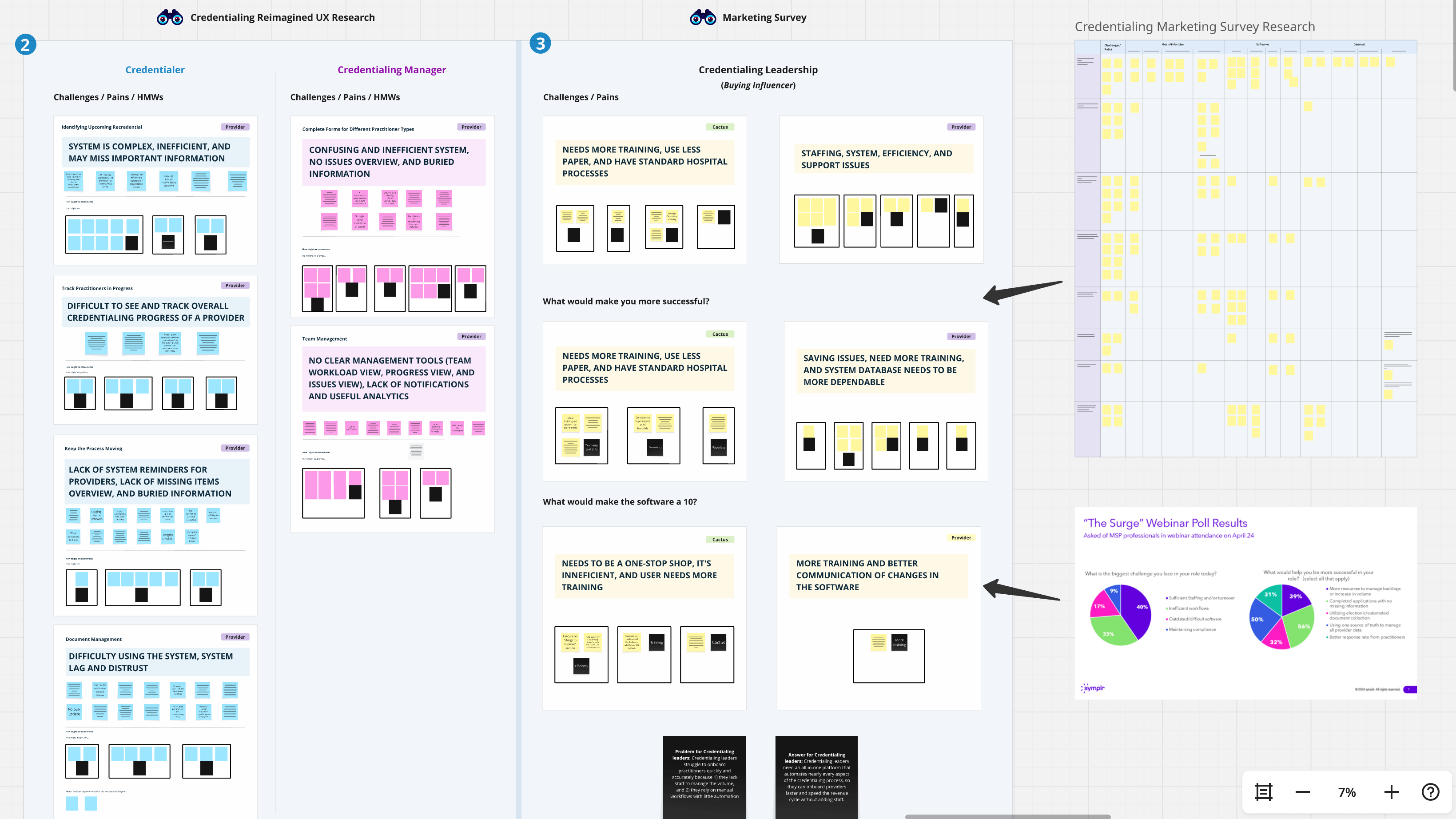
Consolidated insights from UX research, Marketing surveys, and personas across credentialers and leadership to identify shared and distinct pain points.

Aligned on the vision across Product leadership, UX, Technical Writing, Support, Marketing, and clinical subject matter experts.

Created a credentialer vision statement to guide the upcoming vision prototype initiative.
Leveraging research insights and the vision statement, I designed a 5-10 year concept of the credentialing workflow. To reinforce the futuristic nature, I applied a dark mode theme and restructured the navigation—visual signals that this is a forward-looking prototype, not a near-term product.
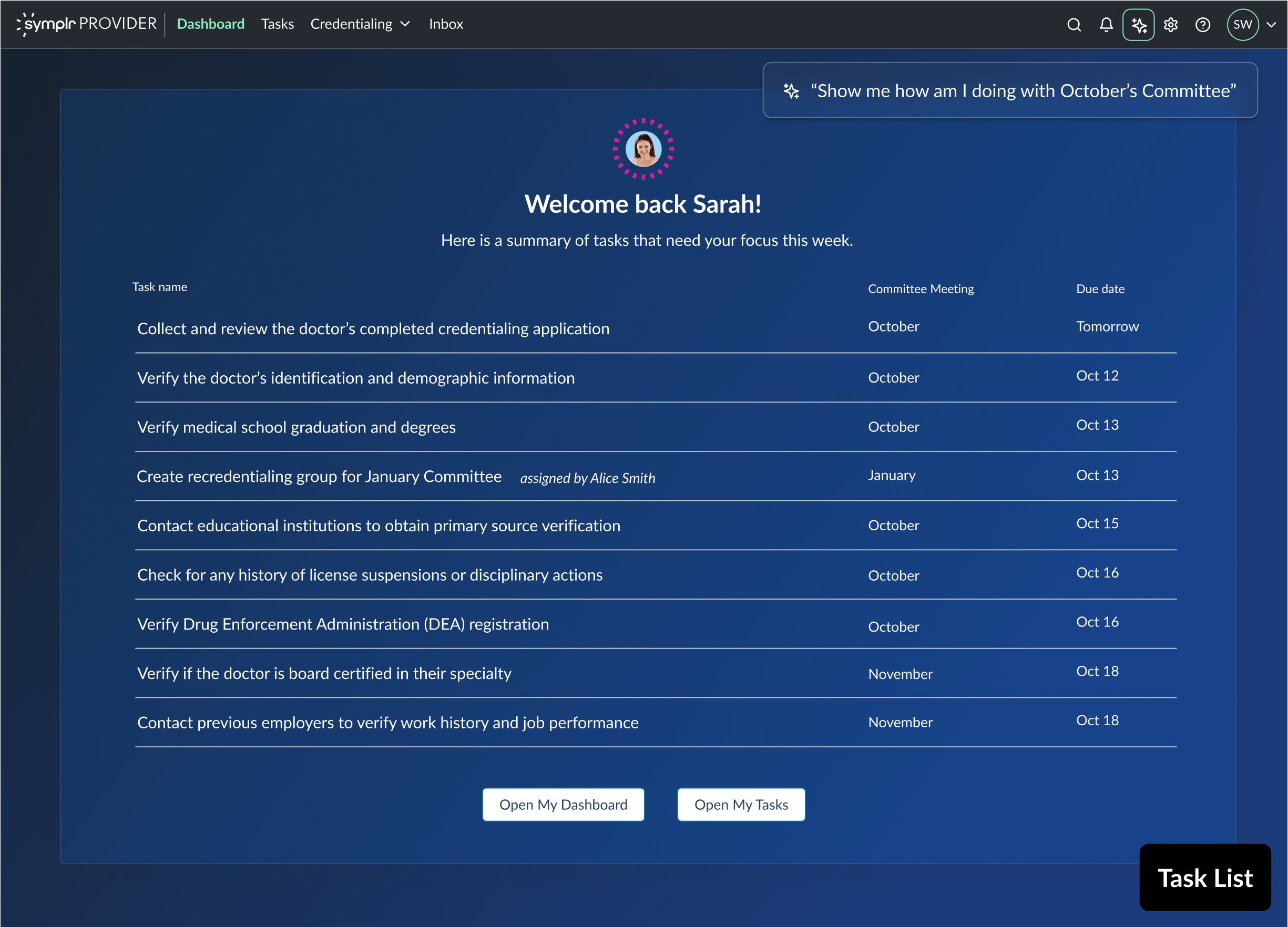
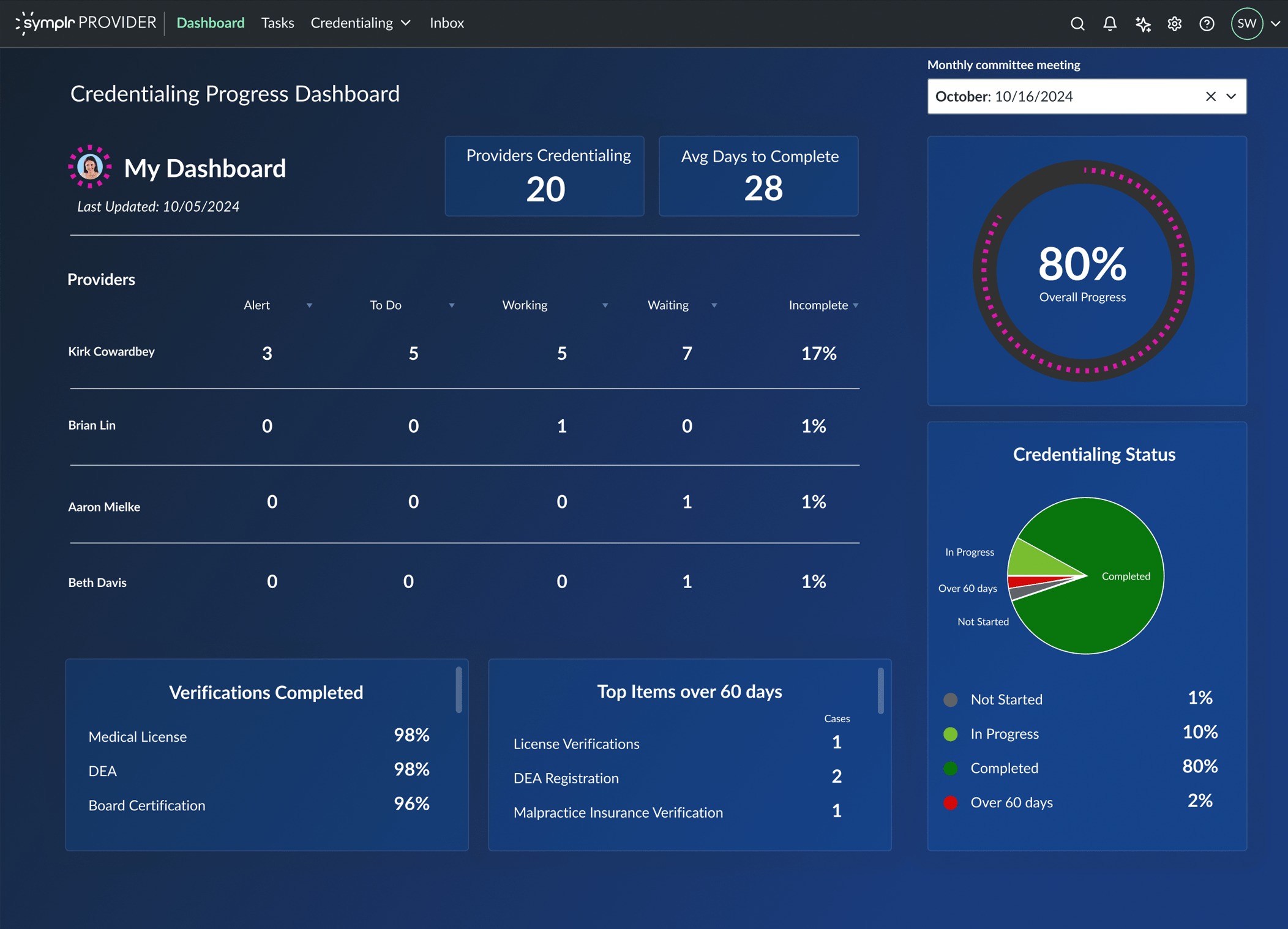
Sarah, a credentialer, logs in Monday morning after being out last week. A personalized task summary helps her quickly get back on track.
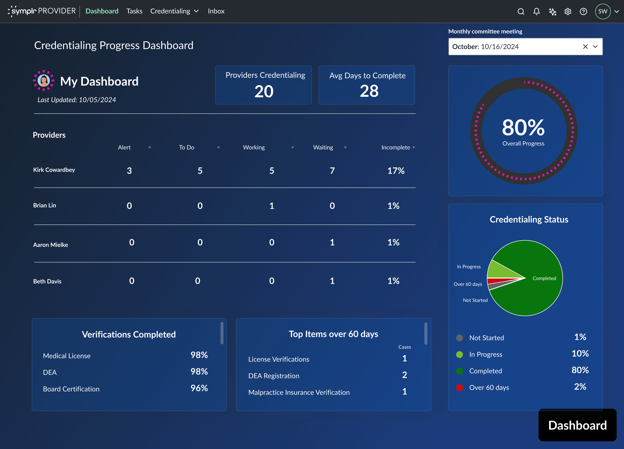
Sarah uses the dashboard to quickly identify her priority—Dr. Kirk—and see what tasks still need attention.

The system auto-generates verification lists based on provider type, specialty, and facility—eliminating manual spreadsheet work. Sarah confirms the NPDB fee will charge the correct account and sees everything is already configured correctly. With no customization needed, she kicks off the verification process.
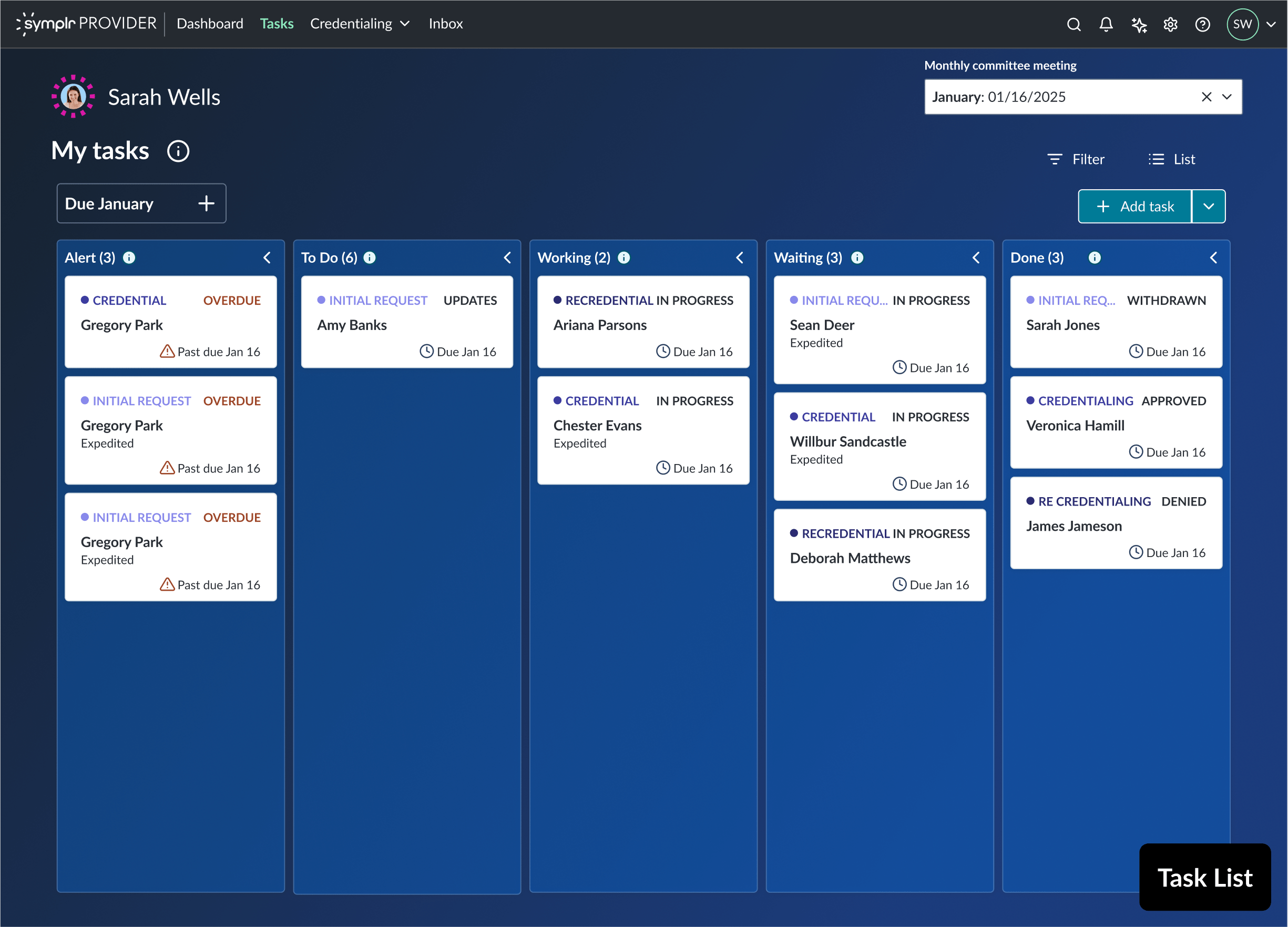
Missing tasks automatically populate Sarah's main task list—no more digging through multiple levels to find what needs attention. She can now focus on completing January's committee verifications. A quick check confirms October's committee is done. The streamlined system keeps everything visible and manageable.
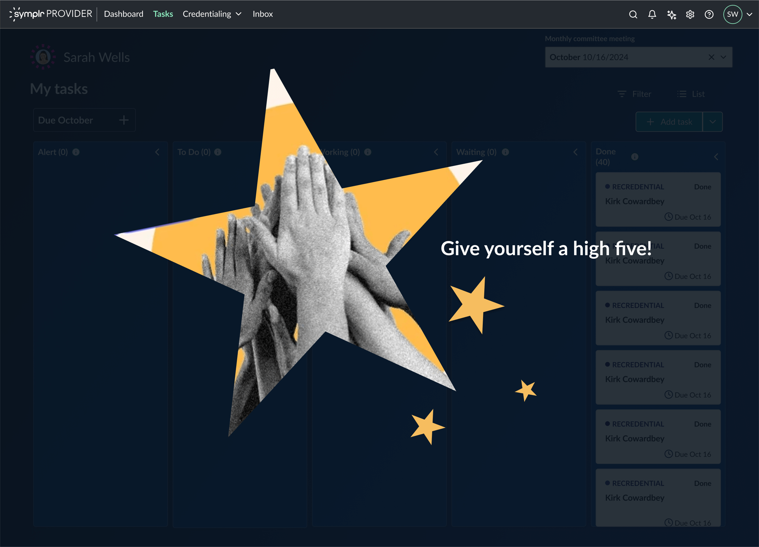
When Sarah completes all her credentialing tasks, the system acknowledges her accomplishment with a congratulatory message.
The credentialing vision prototype successfully communicated a compelling 5-10 year roadmap to stakeholders, generating excitement and alignment across Product, Marketing, Support, and clinical teams.
By visualizing solutions to deeply researched pain points—like automated verification lists, consolidated task tracking, and intelligent reminders—the concept demonstrated how credentialers could save hours of manual work and reduce missed deadlines.
The prototype serves as a north star for future product decisions, with plans to expand into additional credentialing phases. Its "concept car" positioning allows selective external showcasing to gauge market interest while setting clear expectations that these are aspirational features, not near-term releases.
Next steps include presenting to executive leadership to secure funding for phased development.
This project was to revamp the clipping interface for the company's flagship product. By interviewing potential customers, we discovered that the original clipping interface was too complex to learn. After some competitor research and user testing, I designed a solution that met the users' needs. I added new panels at the bottom that visually showed the start and end clip points. Each panel allowed the user to easily move 1 second or 1 frame, forward or back, in the timeline. This allowed for frame accurate clip creation. I also added a play button to preview that portion of the clip. Feedback was very positive from customers and this new version of the clipping interface was implemented into the product.
February 2020
by Joel Gabiola
UX/UI, Interface